Chapter 3 Analysis
First lesson: stick them with the pointy end.
— Jon Snow
Previous chapters focused on introducing Spark with R, getting you up to speed and encouraging you to try basic data analysis workflows. However, they have not properly introduced what data analysis means, especially with Spark. They presented the tools you will need throughout this book—tools that will help you spend more time learning and less time troubleshooting.
This chapter introduces tools and concepts to perform data analysis in Spark from R. Spoiler alert: these are the same tools you use with plain R! This is not a mere coincidence; rather, we want data scientists to live in a world where technology is hidden from them, where you can use the R packages you know and love, and they “just work” in Spark! Now, we are not quite there yet, but we are also not that far. Therefore, in this chapter you learn widely used R packages and practices to perform data analysis—dplyr, ggplot2, formulas, rmarkdown, and so on—which also happen to work in Spark.
Chapter 4 will focus on creating statistical models to predict, estimate, and describe datasets, but first, let’s get started with analysis!
3.1 Overview
In a data analysis project, the main goal is to understand what the data is trying to “tell us”, hoping that it provides an answer to a specific question. Most data analysis projects follow a set of steps, as shown in Figure 3.1.
As the diagram illustrates, we first import data into our analysis stem, where we wrangle it by trying different data transformations, such as aggregations. We then visualize the data to help us perceive relationships and trends. To gain deeper insight, we can fit one or multiple statistical models against sample data. This will help us find out whether the patterns hold true when new data is applied to them. Lastly, the results are communicated publicly or privately to colleagues and stakeholders.
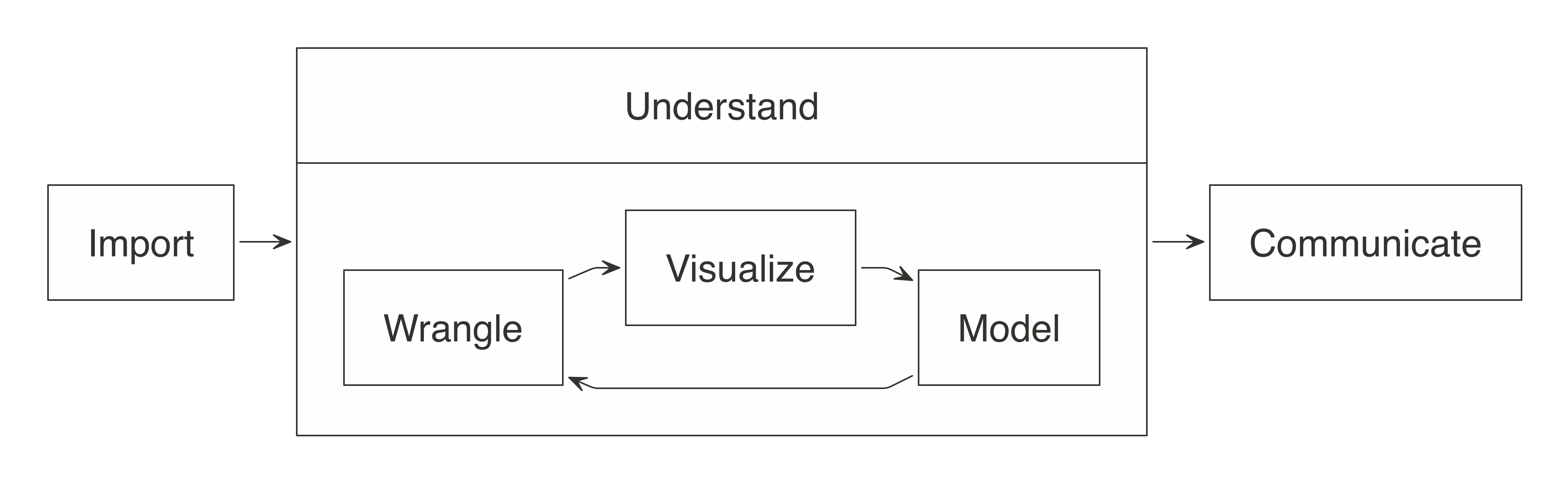
FIGURE 3.1: The general steps of a data analysis
When working with not-large-scale datasets—as in datasets that fit in memory—we can perform all those steps from R, without using Spark. However, when data does not fit in memory or computation is simply too slow, we can slightly modify this approach by incorporating Spark. But how?
For data analysis, the ideal approach is to let Spark do what it’s good at. Spark is a(((“parallel execution”))) parallel computation engine that works at a large scale and provides a SQL engine and modeling libraries. You can use these to perform most of the same operations R performs. Such operations include data selection, transformation, and modeling. Additionally, Spark includes tools for performing specialized computational work like graph analysis, stream processing, and many others. For now, we will skip those non-rectangular datasets and present them in later chapters.
You can perform data import, wrangling, and modeling within Spark. You can also partly do visualization with Spark, which we cover later in this chapter. The idea is to use R to tell Spark what data operations to run, and then only bring the results into R. As illustrated in Figure 3.2, the ideal method pushes compute to the Spark cluster and then collects results into R.
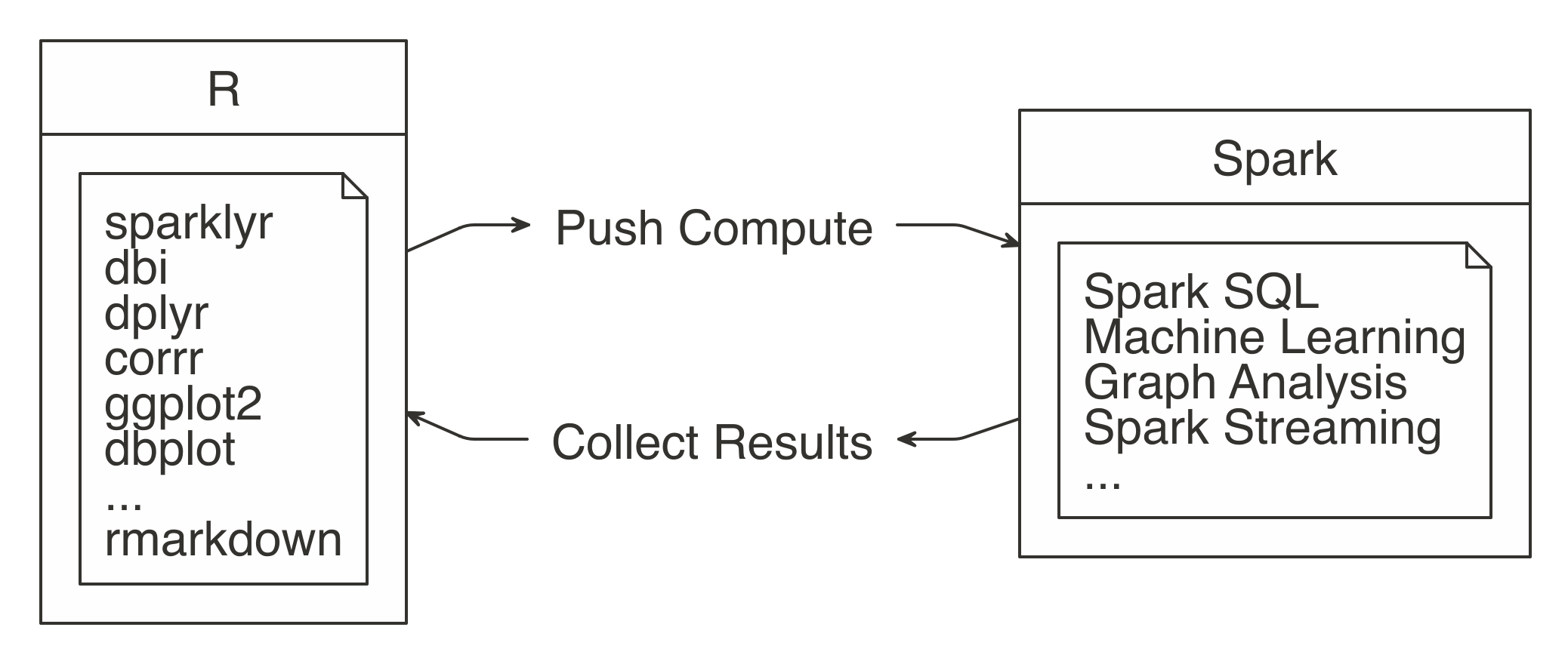
FIGURE 3.2: Spark computes while R collects results
The sparklyr package aids in using the “push compute, collect results” principle. Most of its functions are wrappers on top of Spark API calls. This allows us to take advantage of Spark’s analysis components, instead of R’s. For example, when you need to fit a linear regression model, instead of using R’s familiar lm() function, you would use Spark’s ml_linear_regression() function. This R function then calls Spark to create this model. Figure 3.3 depicts this specific example.
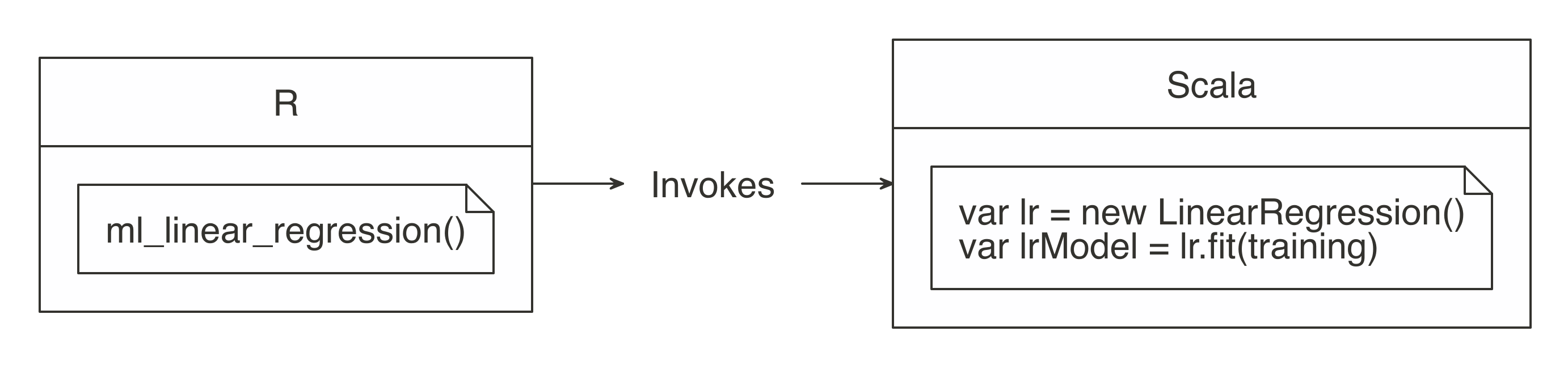
FIGURE 3.3: R functions call Spark functionality
For more common data manipulation tasks, sparklyr provides a backend for dplyr. This means you can use dplyr verbs with which you’re already familiar in R, and then sparklyr and dplyr will translate those actions into Spark SQL statements, which are generally more compact and easier to read than SQL statements (see Figure 3.4). So, if you are already familiar with R and dplyr, there is nothing new to learn. This might feel a bit anticlimactic—indeed, it is—but it’s also great since you can focus that energy on learning other skills required to do large-scale computing.

FIGURE 3.4: dplyr writes SQL in Spark
To practice as you learn, the rest of this chapter’s code uses a single exercise that runs in the local Spark master. This way, you can replicate the code on your personal computer. Make sure sparklyr is already working, which should be the case if you completed Chapter 2.
This chapter will make use of packages that you might not have installed. So, first, make sure the following packages are installed by running these commands:
install.packages("ggplot2")
install.packages("corrr")
install.packages("dbplot")
install.packages("rmarkdown")
First, load the sparklyr and dplyr packages and then open a new local connection.
The environment is ready to be used, so our next task is to import data that we can later analyze.
3.2 Import
When using Spark with R, you need to approach importing data differently. Usually, importing means that R will read files and load them into memory; when you are using Spark, the data is imported into Spark, not R. In Figure 3.5, notice how the data source is connected to Spark instead of being connected to R.
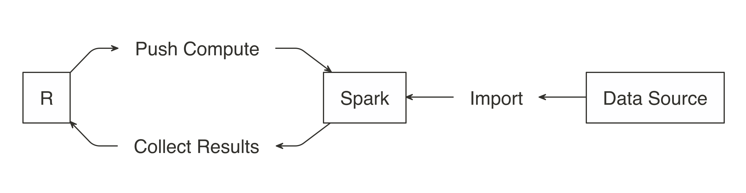
FIGURE 3.5: Import data to Spark not R
Note: When you’re performing analysis over large-scale datasets, the vast majority of the necessary data will already be available in your Spark cluster (which is usually made available to users via Hive tables or by accessing the file system directly). Chapter 8 will cover this extensively.
Rather than importing all data into Spark, you can request Spark to access the data source without importing it—this is a decision you should make based on speed and performance. Importing all of the data into the Spark session incurs a one-time up-front cost, since Spark needs to wait for the data to be loaded before analyzing it. If the data is not imported, you usually incur a cost with every Spark operation since Spark needs to retrieve a subset from the cluster’s storage, which is usually disk drives that happen to be much slower than reading from Spark’s memory. More on this topic will be covered in Chapter 9.
Let’s prime the session with some data by importing mtcars into Spark using copy_to(); you can also import data from distributed files in many different file formats, which we look at in Chapter 8.
Note: When using real clusters, you should use copy_to() to transfer only small tables from R; large data transfers should be performed with specialized data transfer tools.
The data is now accessible to Spark and you can now apply transformations with ease; the next section covers how to wrangle data by running transformations inside Spark, using dplyr.
3.3 Wrangle
Data wrangling uses transformations to understand the data. It is often referred to as the process of transforming data from one “raw” data form into another format with the intent of making it more appropriate for data analysis.
Malformed or missing values and columns with multiple attributes are common data problems you might need to fix, since they prevent you from understanding your dataset. For example, a “name” field contains the last and first name of a customer. There are two attributes (first and last name) in a single column. To be usable, we need to transform the “name” field, by changing it into “first_name” and “last_name” fields.
After the data is cleaned, you still need to understand the basics about its content. Other transformations such as aggregations can help with this task. For example, the result of requesting the average balance of all customers will return a single row and column. The value will be the average of all customers. That information will give us context when we see individual, or grouped, customer balances.
The main goal is to write the data transformations using R syntax as much as possible. This saves us from the cognitive cost of having to switch between multiple computer technologies to accomplish a single task. In this case, it is better to take advantage of dplyr instead of writing Spark SQL statements for data exploration.
In the R environment, cars can be treated as if it were a local DataFrame, so you can use dplyr verbs. For instance, we can find out the mean of all columns by using summarise_all():
# Source: spark<?> [?? x 11]
mpg cyl disp hp drat wt qsec vs am gear carb
<dbl> <dbl> <dbl> <dbl> <dbl> <dbl> <dbl> <dbl> <dbl> <dbl> <dbl>
1 20.1 6.19 231. 147. 3.60 3.22 17.8 0.438 0.406 3.69 2.81While this code is exactly the same as the code you would run when using dplyr without Spark, a lot is happening under the hood. The data is not being imported into R; instead, dplyr converts this task into SQL statements that are then sent to Spark. The show_query() command makes it possible to peer into the SQL statement that sparklyr and dplyr created and sent to Spark. We can also use this time to introduce the pipe operator (%>%), a custom operator from the magrittr package that pipes a computation into the first argument of the next function, making your data analysis much easier to read:
<SQL>
SELECT AVG(`mpg`) AS `mpg`, AVG(`cyl`) AS `cyl`, AVG(`disp`) AS `disp`,
AVG(`hp`) AS `hp`, AVG(`drat`) AS `drat`, AVG(`wt`) AS `wt`,
AVG(`qsec`) AS `qsec`, AVG(`vs`) AS `vs`, AVG(`am`) AS `am`,
AVG(`gear`) AS `gear`, AVG(`carb`) AS `carb`
FROM `mtcars`As is evident, dplyr is much more concise than SQL, but rest assured, you will not need to see or understand SQL when using dplyr. Your focus can remain on obtaining insights from the data, as opposed to figuring out how to express a given set of transformations in SQL. Here is another example that groups the cars dataset by transmission type:
cars %>%
mutate(transmission = ifelse(am == 0, "automatic", "manual")) %>%
group_by(transmission) %>%
summarise_all(mean)# Source: spark<?> [?? x 12]
transmission mpg cyl disp hp drat wt qsec vs am gear carb
<chr> <dbl> <dbl> <dbl> <dbl> <dbl> <dbl> <dbl> <dbl> <dbl> <dbl> <dbl>
1 automatic 17.1 6.95 290. 160. 3.29 3.77 18.2 0.368 0 3.21 2.74
2 manmual 24.4 5.08 144. 127. 4.05 2.41 17.4 0.538 1 4.38 2.92Most of the data transformation operations made available by dplyr to work with local DataFrames are also available to use with a Spark connection. This means that you can focus on learning dplyr first and then reuse that skill when working with Spark. Chapter 5 from the book R for Data Science by Hadley Wickham and Garrett Grolemund (O’Reilly) is a great resource to learn dplyr in depth. If proficiency with dplyr is not an issue for you, we recommend that you take some time to experiment with different dplyr functions against the cars table.
Sometimes, we might need to perform an operation not yet available through dplyr and sparklyr. Instead of downloading the data into R, there is usually a Hive function within Spark to accomplish what we need. The next section covers this scenario.
3.3.1 Built-in Functions
Spark SQL is based on Hive’s SQL conventions and functions, and it is possible to call all these functions using dplyr as well. This means that we can use any Spark SQL functions to accomplish operations that might not be available via dplyr. We can access the functions by calling them as if they were R functions. Instead of failing, dplyr passes functions it does not recognize as is to the query engine. This gives us a lot of flexibility on the functions we can use.
For instance, the percentile() function returns the exact percentile of a column in a group. The function expects a column name, and either a single percentile value or an array of percentile values. We can use this Spark SQL function from dplyr, as follows:
# Source: spark<?> [?? x 1]
mpg_percentile
<dbl>
1 15.4There is no percentile() function in R, so dplyr passes that portion of the code as-is to the resulting SQL query:
<SQL>
SELECT percentile(`mpg`, 0.25) AS `mpg_percentile`
FROM `mtcars_remote`To pass multiple values to percentile(), we can call another Hive function called array(). In this case, array() would work similarly to R’s list() function. We can pass multiple values separated by commas. The output from Spark is an array variable, which is imported into R as a list variable column:
# Source: spark<?> [?? x 1]
mpg_percentile
<list>
1 <list [3]> You can use the explode() function to separate Spark’s array value results into their own record. To do this, use explode() within a mutate() command, and pass the variable containing the results of the percentile operation:
summarise(cars, mpg_percentile = percentile(mpg, array(0.25, 0.5, 0.75))) %>%
mutate(mpg_percentile = explode(mpg_percentile))# Source: spark<?> [?? x 1]
mpg_percentile
<dbl>
1 15.4
2 19.2
3 22.8We have included a comprehensive list of all the Hive functions in the section Hive Functions. Glance over them to get a sense of the wide range of operations that you can accomplish with them.
3.3.2 Correlations
A very common exploration technique is to calculate and visualize correlations, which we often calculate to find out what kind of statistical relationship exists between paired sets of variables. Spark provides functions to calculate correlations across the entire dataset and returns the results to R as a DataFrame object:
# A tibble: 11 x 11
mpg cyl disp hp drat wt qsec
<dbl> <dbl> <dbl> <dbl> <dbl> <dbl> <dbl>
1 1 -0.852 -0.848 -0.776 0.681 -0.868 0.419
2 -0.852 1 0.902 0.832 -0.700 0.782 -0.591
3 -0.848 0.902 1 0.791 -0.710 0.888 -0.434
4 -0.776 0.832 0.791 1 -0.449 0.659 -0.708
5 0.681 -0.700 -0.710 -0.449 1 -0.712 0.0912
6 -0.868 0.782 0.888 0.659 -0.712 1 -0.175
7 0.419 -0.591 -0.434 -0.708 0.0912 -0.175 1
8 0.664 -0.811 -0.710 -0.723 0.440 -0.555 0.745
9 0.600 -0.523 -0.591 -0.243 0.713 -0.692 -0.230
10 0.480 -0.493 -0.556 -0.126 0.700 -0.583 -0.213
11 -0.551 0.527 0.395 0.750 -0.0908 0.428 -0.656
# ... with 4 more variables: vs <dbl>, am <dbl>,
# gear <dbl>, carb <dbl>The corrr R package specializes in correlations. It contains friendly functions to prepare and visualize the results. Included inside the package is a backend for Spark, so when a Spark object is used in corrr, the actual computation also happens in Spark. In the background, the correlate() function runs sparklyr::ml_corr(), so there is no need to collect any data into R prior to running the command:
# A tibble: 11 x 12
rowname mpg cyl disp hp drat wt
<chr> <dbl> <dbl> <dbl> <dbl> <dbl> <dbl>
1 mpg NA -0.852 -0.848 -0.776 0.681 -0.868
2 cyl -0.852 NA 0.902 0.832 -0.700 0.782
3 disp -0.848 0.902 NA 0.791 -0.710 0.888
4 hp -0.776 0.832 0.791 NA -0.449 0.659
5 drat 0.681 -0.700 -0.710 -0.449 NA -0.712
6 wt -0.868 0.782 0.888 0.659 -0.712 NA
7 qsec 0.419 -0.591 -0.434 -0.708 0.0912 -0.175
8 vs 0.664 -0.811 -0.710 -0.723 0.440 -0.555
9 am 0.600 -0.523 -0.591 -0.243 0.713 -0.692
10 gear 0.480 -0.493 -0.556 -0.126 0.700 -0.583
11 carb -0.551 0.527 0.395 0.750 -0.0908 0.428
# ... with 5 more variables: qsec <dbl>, vs <dbl>,
# am <dbl>, gear <dbl>, carb <dbl>We can pipe the results to other corrr functions. For example, the shave() function turns all of the duplicated results into NAs. Again, while this feels like standard R code using existing R packages, Spark is being used under the hood to perform the correlation.
Additionally, as shown in Figure 3.6, the results can be easily visualized using the rplot() function, as shown here:
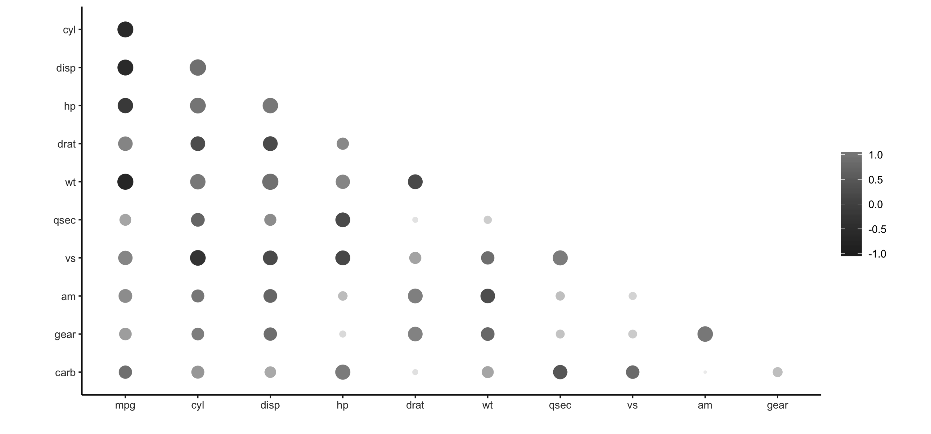
FIGURE 3.6: Using rplot() to visualize correlations
It is much easier to see which relationships are positive or negative: positive relationships are in gray, and negative relationships are black. The size of the circle indicates how significant their relationship is. The power of visualizing data is in how much easier it makes it for us to understand results. The next section expands on this step of the process.
3.4 Visualize
Visualizations are a vital tool to help us find patterns in the data. It is easier for us to identify outliers in a dataset of 1,000 observations when plotted in a graph, as opposed to reading them from a list.
R is great at data visualizations. Its capabilities for creating plots are extended by the many R packages that focus on this analysis step. Unfortunately, the vast majority of R functions that create plots depend on the data already being in local memory within R, so they fail when using a remote table within Spark.
It is possible to create visualizations in R from data sources that exist in Spark. To understand how to do this, let’s first break down how computer programs build plots. To begin, a program takes the raw data and performs some sort of transformation. The transformed data is then mapped to a set of coordinates. Finally, the mapped values are drawn in a plot. Figure 3.7 summarizes each of the steps.
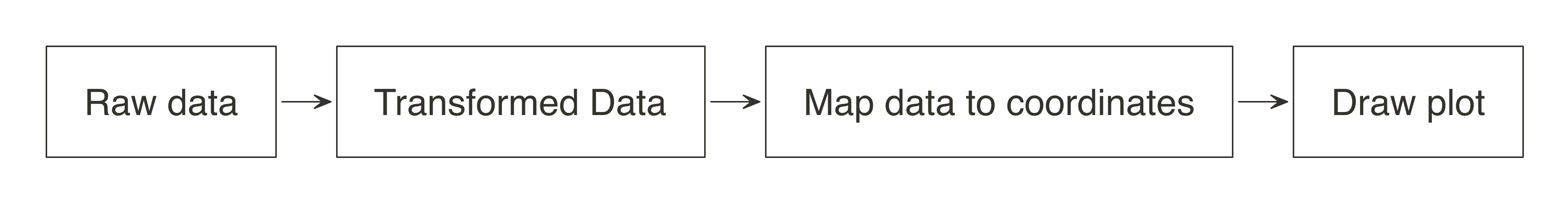
FIGURE 3.7: Stages of an R plot
In essence, the approach for visualizing is the same as in wrangling: push the computation to Spark, and then collect the results in R for plotting. As illustrated in Figure 3.8, the heavy lifting of preparing the data, such as aggregating the data by groups or bins, can be done within Spark, and then the much smaller dataset can be collected into R. Inside R, the plot becomes a more basic operation. For example, for a histogram, the bins are calculated in Spark, and then plotted in R using a simple column plot, as opposed to a histogram plot, because there is no need for R to recalculate the bins.
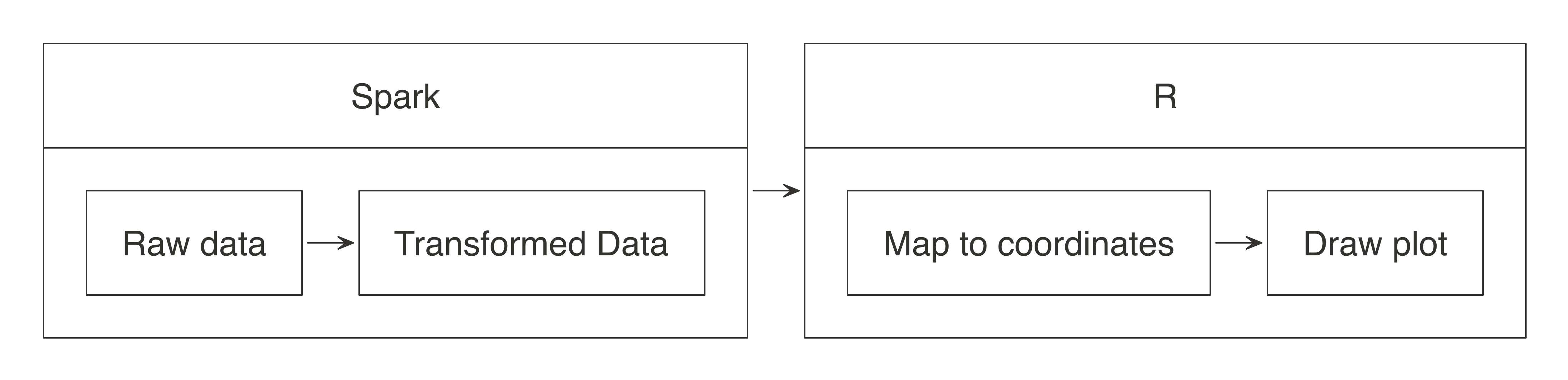
FIGURE 3.8: Plotting with Spark and R
Let’s apply this conceptual model when using ggplot2.
3.4.1 Using ggplot2
To create a bar plot using ggplot2, we simply call a function:
## Warning: package 'ggplot2' was built under R version 3.5.2
FIGURE 3.9: Plotting inside R
In this case, the mtcars raw data was automatically transformed into three discrete aggregated numbers. Next, each result was mapped into an x and y plane. Then the plot was drawn. As R users, all of the stages of building the plot are conveniently abstracted for us.
In Spark, there are a couple of key steps when codifying the “push compute, collect results” approach. First, ensure that the transformation operations happen within Spark. In the example that follows, group_by() and summarise() will run inside Spark. The second is to bring the results back into R after the data has been transformed. Be sure to transform and then collect, in that order; if collect() is run first, R will try to ingest the entire dataset from Spark. Depending on the size of the data, collecting all of the data will slow down or can even bring down your system.
car_group <- cars %>%
group_by(cyl) %>%
summarise(mpg = sum(mpg, na.rm = TRUE)) %>%
collect() %>%
print()# A tibble: 3 x 2
cyl mpg
<dbl> <dbl>
1 6 138.
2 4 293.
3 8 211.In this example, now that the data has been preaggregated and collected into R, only three records are passed to the plotting function:
Figure 3.10 shows the resulting plot.
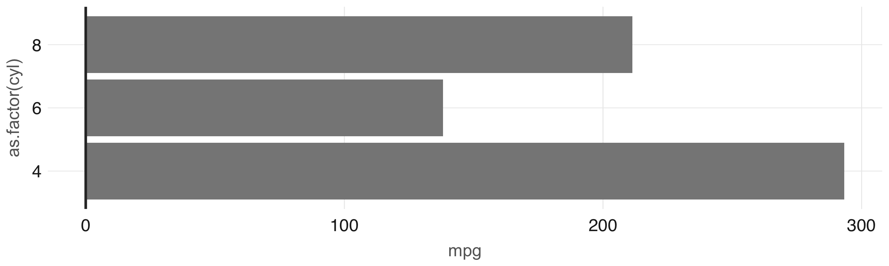
FIGURE 3.10: Plot with aggregation in Spark
Any other ggplot2 visualization can be made to work using this approach; however, this is beyond the scope of the book. Instead, we recommend that you read R Graphics Cookbook, by Winston Chang (O’Reilly) to learn additional visualization techniques applicable to Spark. Now, to ease this transformation step before visualizing, the dbplot package provides a few ready-to-use visualizations that automate aggregation in Spark.
3.4.2 Using dbplot
The dbplot package provides helper functions for plotting with remote data. The R code dbplot that’s used to transform the data is written so that it can be translated into Spark. It then uses those results to create a graph using the ggplot2 package where data transformation and plotting are both triggered by a single function.
The dbplot_histogram() function makes Spark calculate the bins and the count per bin and outputs a ggplot object, which we can further refine by adding more steps to the plot object. dbplot_histogram() also accepts a binwidth argument to control the range used to compute the bins:
library(dbplot)
cars %>%
dbplot_histogram(mpg, binwidth = 3) +
labs(title = "MPG Distribution",
subtitle = "Histogram over miles per gallon")Figure 3.11 presents the resulting plot.
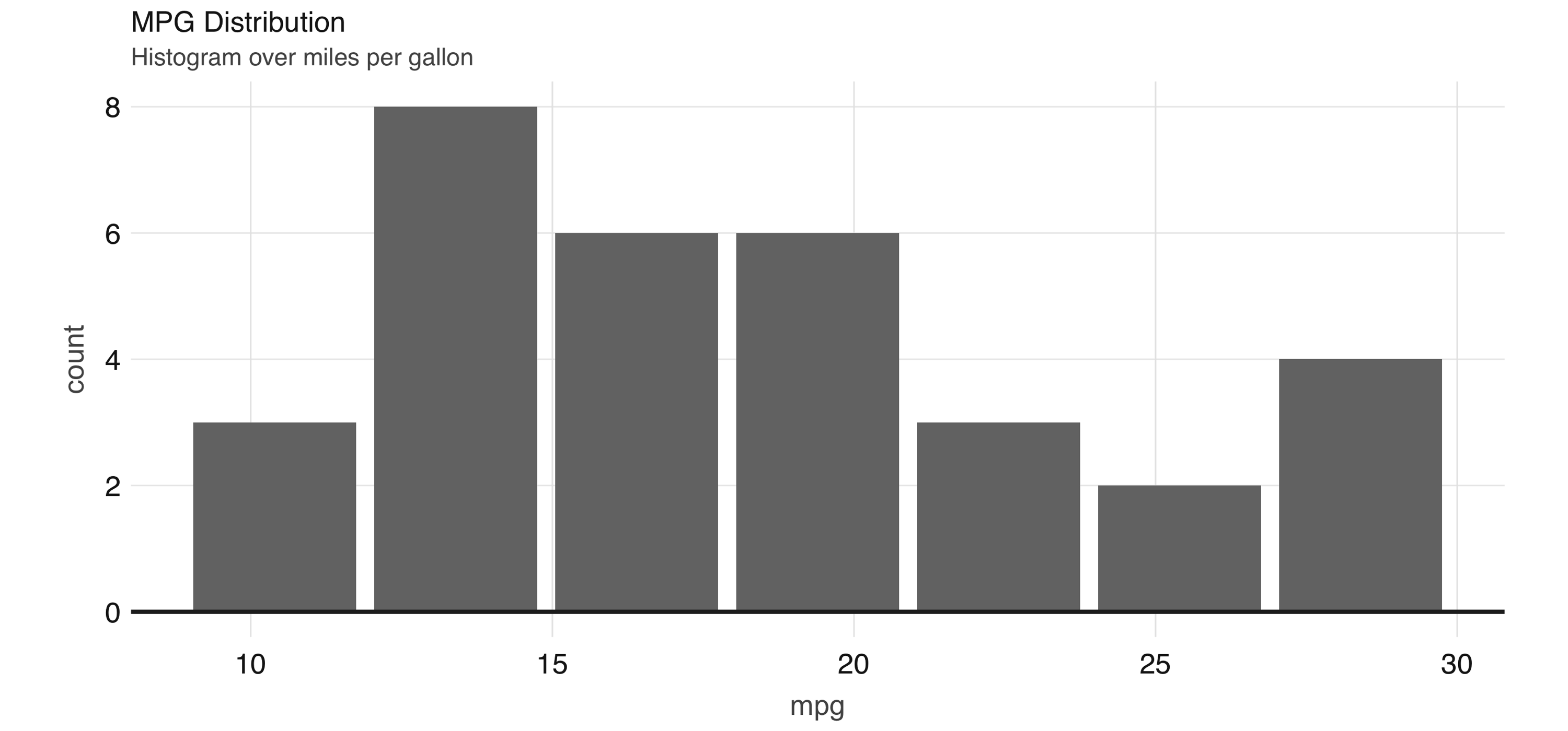
FIGURE 3.11: Histogram created by dbplot
Histograms provide a great way to analyze a single variable. To analyze two variables, a scatter or raster plot is commonly used.
Scatter plots are used to compare the relationship between two continuous variables. For example, a scatter plot will display the relationship between the weight of a car and its gas consumption. The plot in Figure 3.12 shows that the higher the weight, the higher the gas consumption because the dots clump together into almost a line that goes from the upper left toward the lower right. Here’s the code to generate the plot:
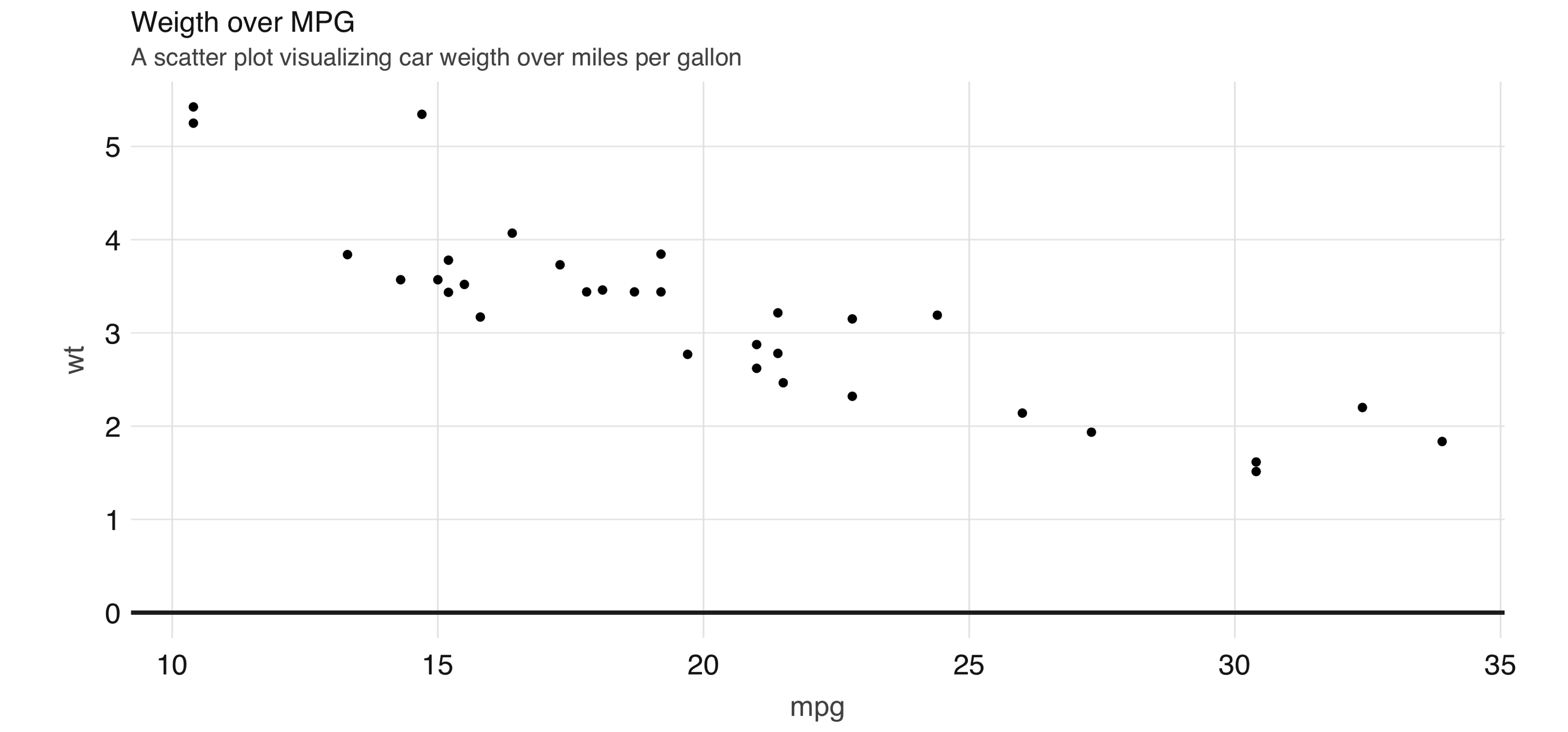
FIGURE 3.12: Scatter plot example in Spark
However, for scatter plots, no amount of “pushing the computation” to Spark will help with this problem because the data must be plotted in individual dots.
The best alternative is to find a plot type that represents the x/y relationship and concentration in a way that it is easy to perceive and to “physically” plot. The raster plot might be the best answer. A raster plot returns a grid of x/y positions and the results of a given aggregation, usually represented by the color of the square.
You can use dbplot_raster() to create a scatter-like plot in Spark, while only retrieving (collecting) a small subset of the remote dataset:
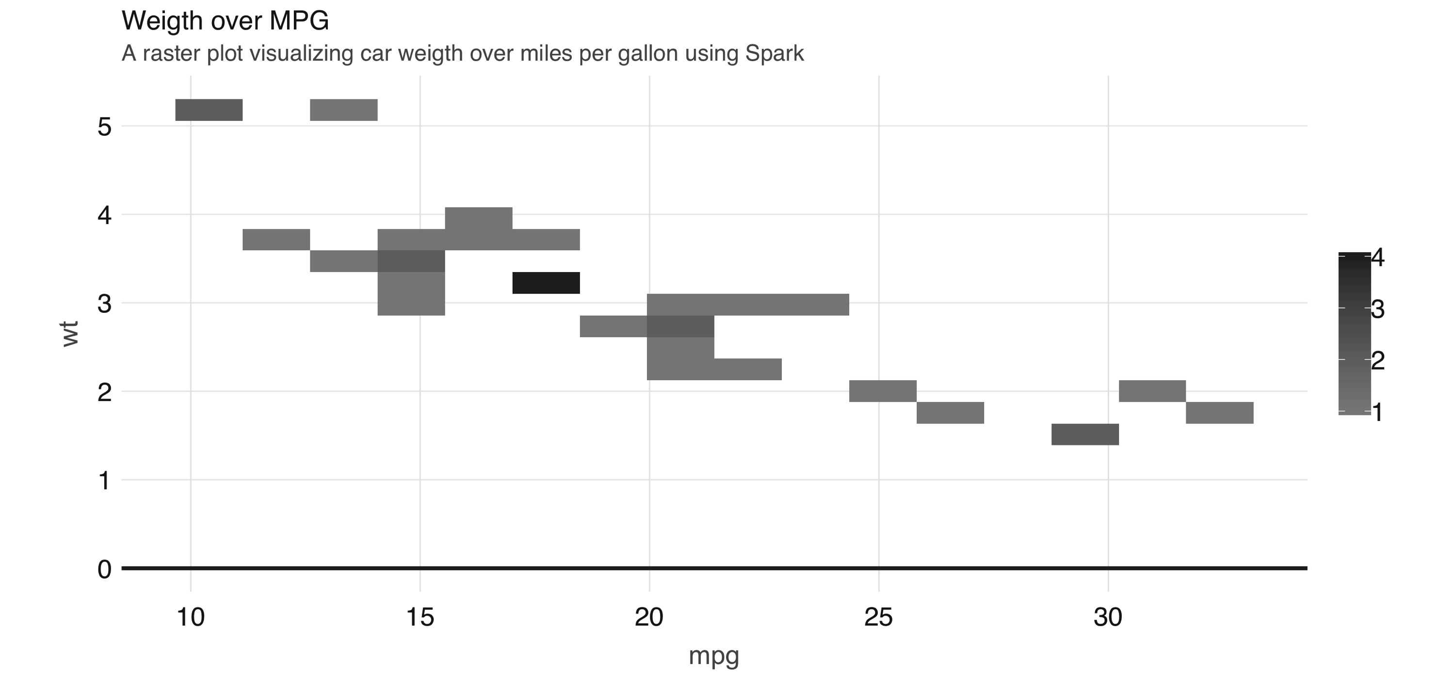
FIGURE 3.13: A raster plot using Spark
As shown in 3.13, the resulting plot returns a grid no bigger than 5 x 5. This limits the number of records that need to be collected into R to 25.
Tip: You can also use dbplot to retrieve the raw data and visualize by other means; to retrieve the aggregates, but not the plots, use db_compute_bins(), db_compute_count(), db_compute_raster(), and db_compute_boxplot().
While visualizations are indispensable, you can complement data analysis using statistical models to gain even deeper insights into our data. The next section describes how we can prepare data for modeling with Spark.
3.5 Model
The next two chapters focus entirely on modeling, so rather than introducing modeling in too much detail in this chapter, we want to cover how to interact with models while doing data analysis.
First, an analysis project goes through many transformations and models to find the answer. That’s why the first data analysis diagram we introduced in Figure 3.2, illustrates a cycle of: visualizing, wrangling, and modeling—we know you don’t end with modeling, not in R, nor when using Spark.
Therefore, the ideal data analysis language enables you to quickly adjust over each wrangle-visualize-model iteration. Fortunately, this is the case when using Spark and R.
To illustrate how easy it is to iterate over wrangling and modeling in Spark, consider the following example. We will start by performing a linear regression against all features and predict miles per gallon:
Deviance Residuals:
Min 1Q Median 3Q Max
-3.4506 -1.6044 -0.1196 1.2193 4.6271
Coefficients:
(Intercept) cyl disp hp drat wt
12.30337416 -0.11144048 0.01333524 -0.02148212 0.78711097 -3.71530393
qsec vs am gear carb
0.82104075 0.31776281 2.52022689 0.65541302 -0.19941925
R-Squared: 0.869
Root Mean Squared Error: 2.147At this point, it is very easy to experiment with different features, we can simply change the R formula from mpg ~ . to, say, mpg ~ hp + cyl to only use horsepower and cylinders as features:
Deviance Residuals:
Min 1Q Median 3Q Max
-4.4948 -2.4901 -0.1828 1.9777 7.2934
Coefficients:
(Intercept) hp cyl
36.9083305 -0.0191217 -2.2646936
R-Squared: 0.7407
Root Mean Squared Error: 3.021Additionally, it is also very easy to iterate with other kinds of models. The following one replaces the linear model with a generalized linear model:
Deviance Residuals:
Min 1Q Median 3Q Max
-4.4948 -2.4901 -0.1828 1.9777 7.2934
Coefficients:
(Intercept) hp cyl
36.9083305 -0.0191217 -2.2646936
(Dispersion parameter for gaussian family taken to be 10.06809)
Null deviance: 1126.05 on 31 degress of freedom
Residual deviance: 291.975 on 29 degrees of freedom
AIC: 169.56Usually, before fitting a model you would need to use multiple dplyr transformations to get it ready to be consumed by a model. To make sure the model can be fitted as efficiently as possible, you should cache your dataset before fitting it, as described next.
3.5.1 Caching
The examples in this chapter are built using a very small dataset. In real-life scenarios, large amounts of data are used for models. If the data needs to be transformed first, the volume of the data could exact a heavy toll on the Spark session. Before fitting the models, it is a good idea to save the results of all the transformations in a new table loaded in Spark memory.
The compute() command can take the end of a dplyr command and save the results to Spark memory:
Deviance Residuals:
Min 1Q Median 3Q Max
-3.47339 -1.37936 -0.06554 1.05105 4.39057
Coefficients:
(Intercept) cyl_cyl_8.0 cyl_cyl_4.0 disp hp drat
16.15953652 3.29774653 1.66030673 0.01391241 -0.04612835 0.02635025
wt qsec vs am gear carb
-3.80624757 0.64695710 1.74738689 2.61726546 0.76402917 0.50935118
R-Squared: 0.8816
Root Mean Squared Error: 2.041As more insights are gained from the data, more questions might be raised. That is why we expect to iterate through the data wrangle, visualize, and model cycle multiple times. Each iteration should provide incremental insights into what the data is “telling us”. There will be a point when we reach a satisfactory level of understanding. It is at this point that we will be ready to share the results of the analysis. This is the topic of the next section.
3.6 Communicate
It is important to clearly communicate the analysis results—as important as the analysis work itself! The public, colleagues, or stakeholders need to understand what you found out and how.
To communicate effectively, we need to use artifacts such as reports and presentations; these are common output formats that we can create in R, using R Markdown.
R Markdown documents allow you to weave narrative text and code together. The variety of output formats provides a very compelling reason to learn and use R Markdown. There are many available output formats like HTML, PDF, PowerPoint, Word, web slides, websites, books, and so on.
Most of these outputs are available in the core R packages of R Markdown: knitr and rmarkdown. You can extend R Markdown with other R packages. For example, this book was written using R Markdown thanks to an extension provided by the bookdown package. The best resource to delve deeper into R Markdown is the official book.14
In R Markdown, one singular artifact could potentially be rendered in different formats. For example, you could render the same report in HTML or as a PDF file by changing a setting within the report itself. Conversely, multiple types of artifacts could be rendered as the same output. For example, a presentation deck and a report could be rendered in HTML.
Creating a new R Markdown report that uses Spark as a computer engine is easy. At the top, R Markdown expects a YAML header. The first and last lines are three consecutive dashes (---). The content in between the dashes varies depending on the type of document. The only required field in the YAML header is the output value. R Markdown needs to know what kind of output it needs to render your report into. This YAML header is called frontmatter. Following the frontmatter are sections of code, called code chunks. These code chunks can be interlaced with the narratives. There is nothing particularly interesting to note when using Spark with R Markdown; it is just business as usual.
Since an R Markdown document is self-contained and meant to be reproducible, before rendering documents, we should first disconnect from Spark to free resources:
The following example shows how easy it is to create a fully reproducible report that uses Spark to process large-scale datasets. The narrative, code, and, most important, the output of the code is recorded in the resulting HTML file. You can copy and paste the following code in a file. Save the file with a .Rmd extension, and choose whatever name you would like:
---
title: "mtcars analysis"
output:
html_document:
fig_width: 6
fig_height: 3
---
```{r, setup, include = FALSE}
library(sparklyr)
library(dplyr)

sc <- spark_connect(master = "local", version = "2.3")
cars <- copy_to(sc, mtcars)
```
## Visualize
Aggregate data in Spark, visualize in R.
```{r fig.align='center', warning=FALSE}
library(ggplot2)
cars %>%
group_by(cyl) %>% summarise(mpg = mean(mpg)) %>%
ggplot(aes(cyl, mpg)) + geom_bar(stat="identity")
```
## Model
The selected model was a simple linear regression that
uses the weight as the predictor of MPG
```{r}
cars %>%
ml_linear_regression(wt ~ mpg) %>%
summary()
```
```{r, include = FALSE}
spark_disconnect(sc)
```To(((“commands”, “render()”))) knit this report, save the file with a .Rmd extension such as report.Rmd, and run render() from R. The output should look like that shown in Figure 3.14.
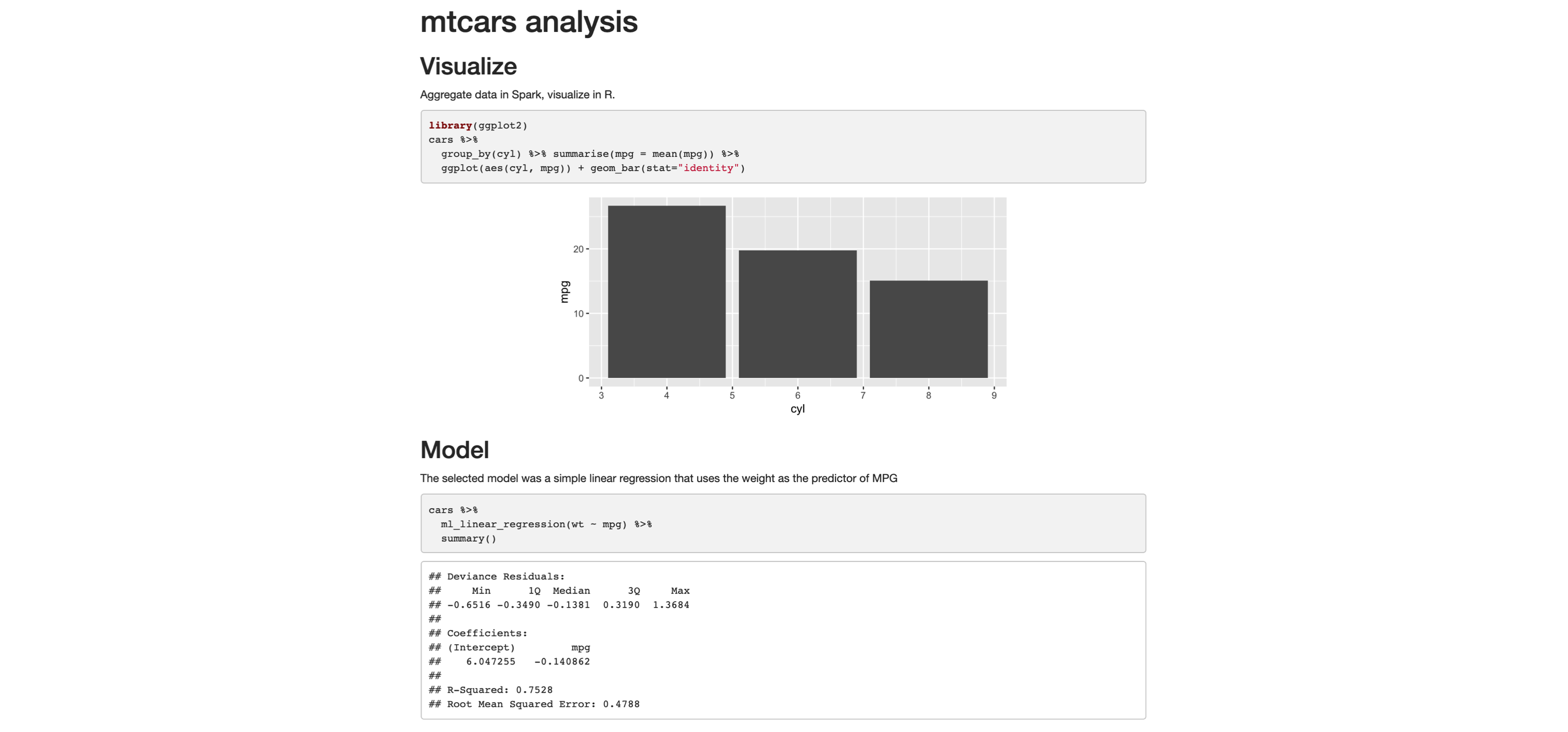
FIGURE 3.14: R Markdown HTML output
You can now easily share this report, and viewers of won’t need Spark or R to read and consume its contents; it’s just a self-contained HTML file, trivial to open in any browser.
It is also common to distill insights of a report into many other output formats. Switching is quite easy: in the top frontmatter, change the output option to powerpoint_presentation, pdf_document, word_document, or the like. Or you can even produce multiple output formats from the same report:
---
title: "mtcars analysis"
output:
  word_document: default
  pdf_document: default
  powerpoint_presentation: default
---
The result will be a PowerPoint presentation, a Word document, and a PDF. All of the same information that was displayed in the original HTML report is computed in Spark and rendered in R. You’ll likely need to edit the PowerPoint template or the output of the code chunks.
This minimal example shows how easy it is to go from one format to another. Of course, it will take some more editing on the R user’s side to make sure the slides contain only the pertinent information. The main point is that it does not require that you learn a different markup or code conventions to switch from one artifact to another.
3.7 Recap
This chapter presented a solid introduction to data analysis with R and Spark. Many of the techniques presented looked quite similar to using just R and no Spark, which, while anticlimactic, is the right design to help users already familiar with R to easily transition to Spark. For users unfamiliar with R, this chapter also served as a very brief introduction to some of the most popular (and useful!) packages available in R.
It should now be quite obvious that, together, R and Spark are a powerful combination—a large-scale computing platform, along with an incredibly robust ecosystem of R packages, makes for an ideal analysis platform.
While doing analysis in Spark with R, remember to push computation to Spark and focus on collecting results in R. This paradigm should set up a successful approach to data manipulation, visualization and communication through sharing your results in a variety of outputs.
Chapter 4 will dive deeper into how to build statistical models in Spark using a much more interesting dataset (what’s more interesting than dating datasets?). You will also learn many more techniques that we did not even mention in the brief modeling section from this chapter.
Xie Allaire G (2018). R Markdown: The Definite Guide, 1st edition. CRC Press.↩