Chapter 4 Modeling
I’ve trusted in your visions, in your prophecies, for years.
— Stannis Baratheon
In Chapter 3 you learned how to scale up data analysis to large datasets using Spark. In this chapter, we detail the steps required to build prediction models in Spark. We explore MLlib, the component of Spark that allows you to write high-level code to perform predictive modeling on distributed data, and use data wrangling in the context of feature engineering and exploratory data analysis.
We will start this chapter by introducing modeling in the context of Spark and the dataset you will use throughout the chapter. We then demonstrate a supervised learning workflow that includes exploratory data analysis, feature engineering, and model building. Then we move on to an unsupervised topic modeling example using unstructured text data. Keep in mind that our goal is to show various techniques of executing data science tasks on large data rather than conducting a rigorous and coherent analysis. There are also many other models available in Spark that won’t be covered in this chapter, but by the end of the chapter, you will have the right tools to experiment with additional ones on your own.
While predicting datasets manually is often a reasonable approach (by “manually,” we mean someone imports a dataset into Spark and uses the fitted model to enrich or predict values), it does beg the question, could we automate this process into systems that anyone can use? For instance, how can we build a system that automatically identifies an email as spam without having to manually analyze each email account? Chapter 5 presents the tools to automate data analysis and modeling with pipelines, but to get there, we need to first understand how to train models “by hand”.
4.1 Overview
The R interface to Spark provides modeling algorithms that should be familiar to R users, and we’ll go into detail in the chapter. For instance, we’ve already used ml_linear_regression(cars, mpg ~ .), but we could run ml_logistic_regression(cars, am ~ .) just as easily.
Take a moment to look at the long list of MLlib functions included in the appendix of this book; a quick glance at this list shows that Spark supports Decision Trees, Gradient-Boosted Trees, Accelerated Failure Time Survival Regression, Isotonic Regression, K-Means Clustering, Gaussian Mixture Clustering, and more.
As you can see, Spark provides a wide range of algorithms and feature transformers, and here we touch on a representative portion of the functionality. A complete treatment of predictive modeling concepts is beyond the scope of this book, so we recommend complementing this discussion with R for Data Science by Hadley Wickham and Garrett Grolemund G (O’Reilly) and Feature Engineering and Selection: A Practical Approach for Predictive Models,15 from which we adopted (sometimes verbatim) some of the examples and visualizations in this chapter.
This chapter focuses on predictive modeling, since Spark aims to enable machine learning as opposed to statistical inference. Machine learning is often more concerned about forecasting the future rather than inferring the process by which our data is generated,16 which is then used to create automated systems. Machine learning can be categorized into supervised learning (predictive modeling) and unsupervised learning. In supervised learning, we try to learn a function that will map from X to Y, from a dataset of (x, y) examples. In unsupervised learning, we just have X and not the Y labels, so instead we try to learn something about the structure of X. Some practical use cases for supervised learning include forecasting tomorrow’s weather, determining whether a credit card transaction is fraudulent, and coming up with a quote for your car insurance policy. With unsupervised learning, examples include automated grouping of photos of individuals, segmenting customers based on their purchase history, and clustering of documents.
The ML interface in sparklyr has been designed to minimize the cognitive effort for moving from a local, in-memory, native-R workflow to the cluster, and back. While the Spark ecosystem is very rich, there is still a tremendous number of packages from CRAN, with some implementing functionality that you might require for a project. Also, you might want to leverage your skills and experience working in R to maintain productivity. What we learned in Chapter 3 also applies here—it is important to keep track of where you are performing computations and move between the cluster and your R session as appropriate.
The examples in this chapter utilize the OkCupid dataset.17 The dataset consists of user profile data from an online dating site and contains a diverse set of features, including biographical characteristics such as gender and profession, as well as free text fields related to personal interests. There are about 60,000 profiles in the dataset, which fits comfortably into memory on a modern laptop and wouldn’t be considered “big data”, so you can easily follow along running Spark in local mode.
You can download this dataset as follows:
download.file(
  "https://github.com/r-spark/okcupid/raw/master/profiles.csv.zip",
  "okcupid.zip")

unzip("okcupid.zip", exdir = "data")
unlink("okcupid.zip")
We don’t recommend sampling this dataset since the model won’t be nearly as rich; however, if you have limited hardware resources, you are welcome to sample it as follows:
profiles <- read.csv("data/profiles.csv")
write.csv(dplyr::sample_n(profiles, 10^3),
          "data/profiles.csv", row.names = FALSE)
Note: The examples in this chapter utilize small datasets so that you can easily follow along in local mode. In practice, if your dataset fits comfortably in memory on your local machine, you might be better off using an efficient, nondistributed implementation of the modeling algorithm. For example, you might want to use the ranger package instead of ml_random_forest_classifier().
In addition, to follow along, you will need to install a few additional packages:
To motivate the examples, we consider the following problem:
Predict whether someone is actively working—that is, not retired, a student, or unemployed.
Next up, we explore this dataset.
4.2 Exploratory Data Analysis
Exploratory data analysis (EDA), in the context of predictive modeling, is the exercise of looking at excerpts and summaries of the data. The specific goals of the EDA stage are informed by the business problem, but here are some common objectives:
- Check for data quality; confirm meaning and prevalence of missing values and reconcile statistics against existing controls.
- Understand univariate relationships between variables.
- Perform an initial assessment on what variables to include and what transformations need to be done on them.
To begin, we connect to Spark, load libraries, and read in the data:
library(sparklyr)
library(ggplot2)
library(dbplot)
library(dplyr)

sc <- spark_connect(master = "local", version = "2.3")

okc <- spark_read_csv(
  sc,
  "data/profiles.csv",
  escape = "\"",
  memory = FALSE,
  options = list(multiline = TRUE)
) %>%
  mutate(
    height = as.numeric(height),
    income = ifelse(income == "-1", NA, as.numeric(income))
  ) %>%
  mutate(sex = ifelse(is.na(sex), "missing", sex)) %>%
  mutate(drinks = ifelse(is.na(drinks), "missing", drinks)) %>%
  mutate(drugs = ifelse(is.na(drugs), "missing", drugs)) %>%
  mutate(job = ifelse(is.na(job), "missing", job))
We specify escape = "\"" and options = list(multiline = TRUE) here to accommodate embedded quote characters and newlines in the essay fields. We also convert the height and income columns to numeric types and recode missing values in the string columns. Note that it might very well take a few tries of specifying different parameters to get the initial data ingest correct, and sometimes you might need to revisit this step after you learn more about the data during modeling.
We can now take a quick look at our data by using glimpse():
Observations: ??
Variables: 31
Database: spark_connection
$ age <int> 22, 35, 38, 23, 29, 29, 32, 31, 24, 37, 35…
$ body_type <chr> "a little extra", "average", "thin", "thin…
$ diet <chr> "strictly anything", "mostly other", "anyt…
$ drinks <chr> "socially", "often", "socially", "socially…
$ drugs <chr> "never", "sometimes", "missing", "missing"…
$ education <chr> "working on college/university", "working …
$ essay0 <chr> "about me:<br />\n<br />\ni would love to …
$ essay1 <chr> "currently working as an international age…
$ essay2 <chr> "making people laugh.<br />\nranting about…
$ essay3 <chr> "the way i look. i am a six foot half asia…
$ essay4 <chr> "books:<br />\nabsurdistan, the republic, …
$ essay5 <chr> "food.<br />\nwater.<br />\ncell phone.<br…
$ essay6 <chr> "duality and humorous things", "missing", …
$ essay7 <chr> "trying to find someone to hang out with. …
$ essay8 <chr> "i am new to california and looking for so…
$ essay9 <chr> "you want to be swept off your feet!<br />…
$ ethnicity <chr> "asian, white", "white", "missing", "white…
$ height <dbl> 75, 70, 68, 71, 66, 67, 65, 65, 67, 65, 70…
$ income <dbl> NaN, 80000, NaN, 20000, NaN, NaN, NaN, NaN…
$ job <chr> "transportation", "hospitality / travel", …
$ last_online <chr> "2012-06-28-20-30", "2012-06-29-21-41", "2…
$ location <chr> "south san francisco, california", "oaklan…
$ offspring <chr> "doesn’t have kids, but might want t…
$ orientation <chr> "straight", "straight", "straight", "strai…
$ pets <chr> "likes dogs and likes cats", "likes dogs a…
$ religion <chr> "agnosticism and very serious about it", "…
$ sex <chr> "m", "m", "m", "m", "m", "m", "f", "f", "f…
$ sign <chr> "gemini", "cancer", "pisces but it doesn&r…
$ smokes <chr> "sometimes", "no", "no", "no", "no", "no",…
$ speaks <chr> "english", "english (fluently), spanish (p…
$ status <chr> "single", "single", "available", "single",…Now, we add our response variable as a column in the dataset and look at its distribution:
okc <- okc %>%
  mutate(
    not_working = ifelse(job %in% c("student", "unemployed", "retired"), 1 , 0)
  )

okc %>%
  group_by(not_working) %>%
  tally()
# Source: spark<?> [?? x 2]
not_working n
<dbl> <dbl>
1 0 54541
2 1 5405Before we proceed further, let’s perform an initial split of our data into a training set and a testing set and put away the latter. In practice, this is a crucial step because we would like to have a holdout set that we set aside at the end of the modeling process to evaluate model performance. If we were to include the entire dataset during EDA, information from the testing set could “leak” into the visualizations and summary statistics and bias our model-building process even though the data is not used directly in a learning algorithm. This would undermine the credibility of our performance metrics. We can easily split the data by using the sdf_random_split() function:
data_splits <- sdf_random_split(okc, training = 0.8, testing = 0.2, seed = 42)
okc_train <- data_splits$training
okc_test <- data_splits$testing
We can quickly look at the distribution of our response variable:
# Source: spark<?> [?? x 3]
  not_working     n   frac
        <dbl> <dbl>  <dbl>
1           0 43785 0.910
2           1  4317 0.0897
Using the sdf_describe() function, we can obtain numerical summaries of specific columns:
# Source: spark<?> [?? x 3]
  summary age                income
  <chr>   <chr>              <chr>
1 count   48102              9193
2 mean    32.336534863415245 104968.99815076689
3 stddev  9.43908920033797   202235.2291773537
4 min     18                 20000.0
5 max     110                1000000.0
Like we saw in Chapter 3, we can also utilize the dbplot package to plot distributions of these variables. In Figure 4.1 we show a histogram of the distribution of the age variable, which is the result of the following code:
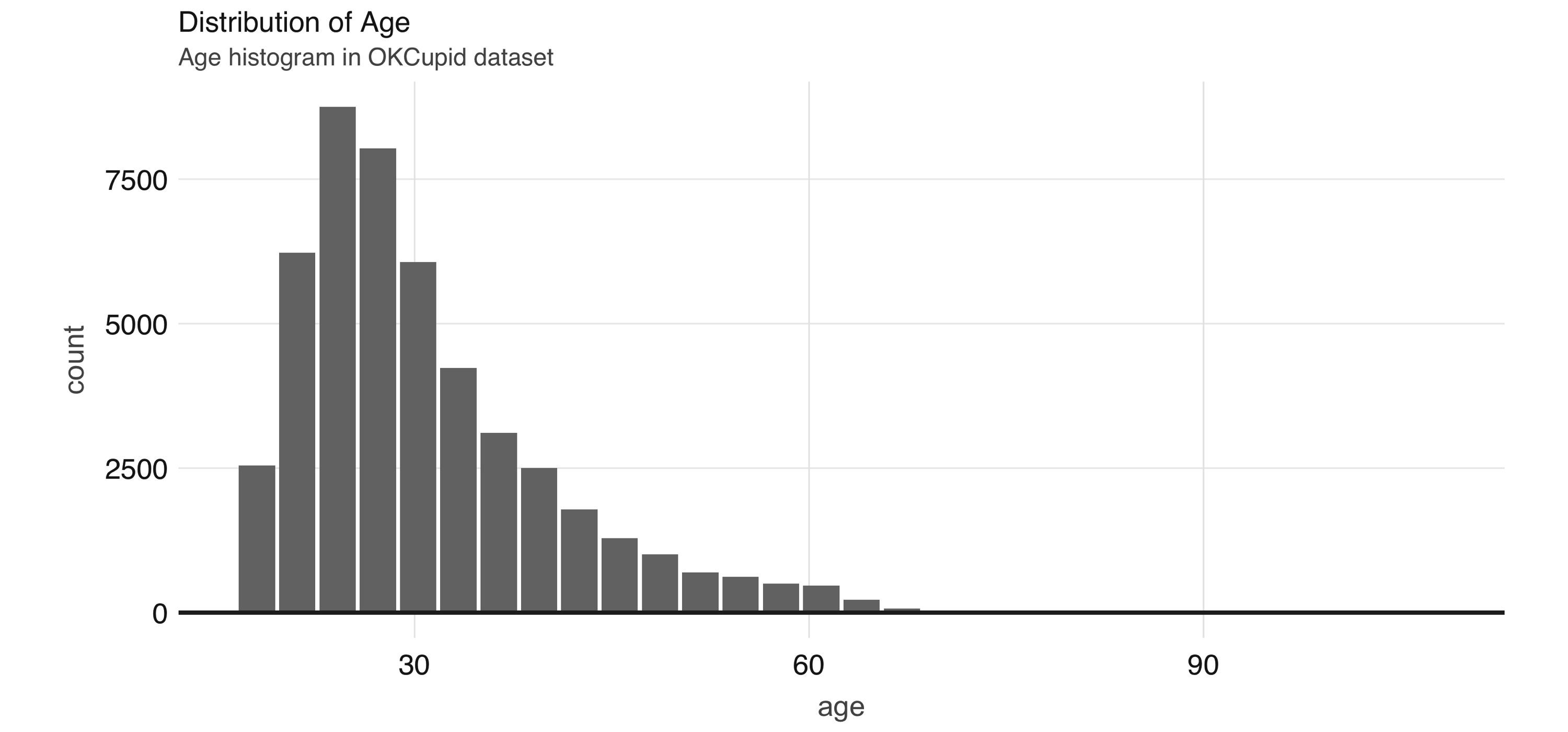
FIGURE 4.1: Distribution of age
A common EDA exercise is to look at the relationships between the response and the individual predictors. Often, you might have prior business knowledge of what these relationships should be, so this can serve as a data quality check. Also, unexpected trends can inform variable interactions that you might want to include in the model. As an example, we can explore the religion variable:
prop_data <- okc_train %>%
  mutate(religion = regexp_extract(religion, "^\\\\w+", 0)) %>%
  group_by(religion, not_working) %>%
  tally() %>%
  group_by(religion) %>%
  summarize(
    count = sum(n),
    prop = sum(not_working * n) / sum(n)
  ) %>%
  mutate(se = sqrt(prop * (1 - prop) / count)) %>%
  collect()

prop_data
# A tibble: 10 x 4
religion count prop se
<chr> <dbl> <dbl> <dbl>
1 judaism 2520 0.0794 0.00539
2 atheism 5624 0.118 0.00436
3 christianity 4671 0.120 0.00480
4 hinduism 358 0.101 0.0159
5 islam 115 0.191 0.0367
6 agnosticism 7078 0.0958 0.00346
7 other 6240 0.0841 0.00346
8 missing 16152 0.0719 0.002
9 buddhism 1575 0.0851 0.007
10 catholicism 3769 0.0886 0.00458Note that prop_data is a small DataFrame that has been collected into memory in our R session, we can take advantage of ggplot2 to create an informative visualization (see Figure 4.2):
prop_data %>%
  ggplot(aes(x = religion, y = prop)) + geom_point(size = 2) +
  geom_errorbar(aes(ymin = prop - 1.96 * se, ymax = prop + 1.96 * se),
                width = .1) +
  geom_hline(yintercept = sum(prop_data$prop * prop_data$count) /
                              sum(prop_data$count))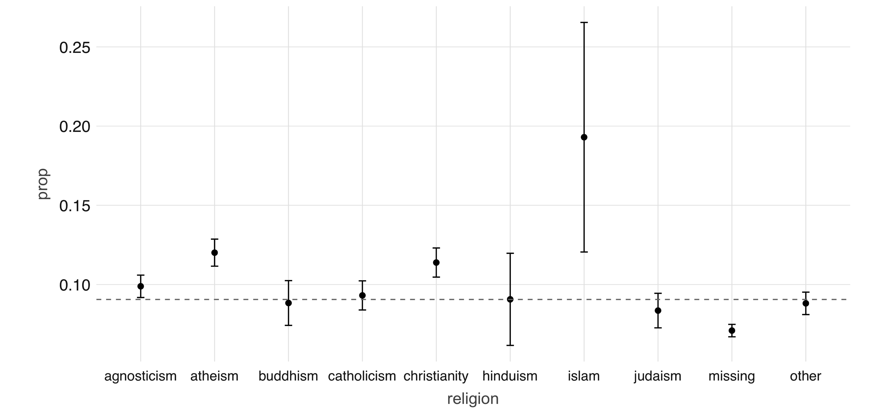
FIGURE 4.2: Proportion of individuals not currently employed, by religion
Next, we take a look at the relationship between a couple of predictors: alcohol use and drug use. We would expect there to be some correlation between them. You can compute a contingency table via sdf_crosstab():
# A tibble: 7 x 5
  drinks_drugs missing never often sometimes
  <chr>          <dbl> <dbl> <dbl>     <dbl>
1 very often        54   144    44       137
2 socially        8221 21066   126      4106
3 not at all       146  2371    15       109
4 desperately       72    89    23        74
5 often           1049  1718    69      1271
6 missing         1121  1226    10        59
7 rarely           613  3689    35       445
We can visualize this contingency table using a mosaic plot (see Figure 4.3):
library(ggmosaic)
library(forcats)
library(tidyr)

contingency_tbl %>%
  rename(drinks = drinks_drugs) %>%
  gather("drugs", "count", missing:sometimes) %>%
  mutate(
    drinks = as_factor(drinks) %>%
      fct_relevel("missing", "not at all", "rarely", "socially",
                  "very often", "desperately"),
    drugs = as_factor(drugs) %>%
      fct_relevel("missing", "never", "sometimes", "often")
  ) %>%
  ggplot() +
  geom_mosaic(aes(x = product(drinks, drugs), fill = drinks,
                  weight = count))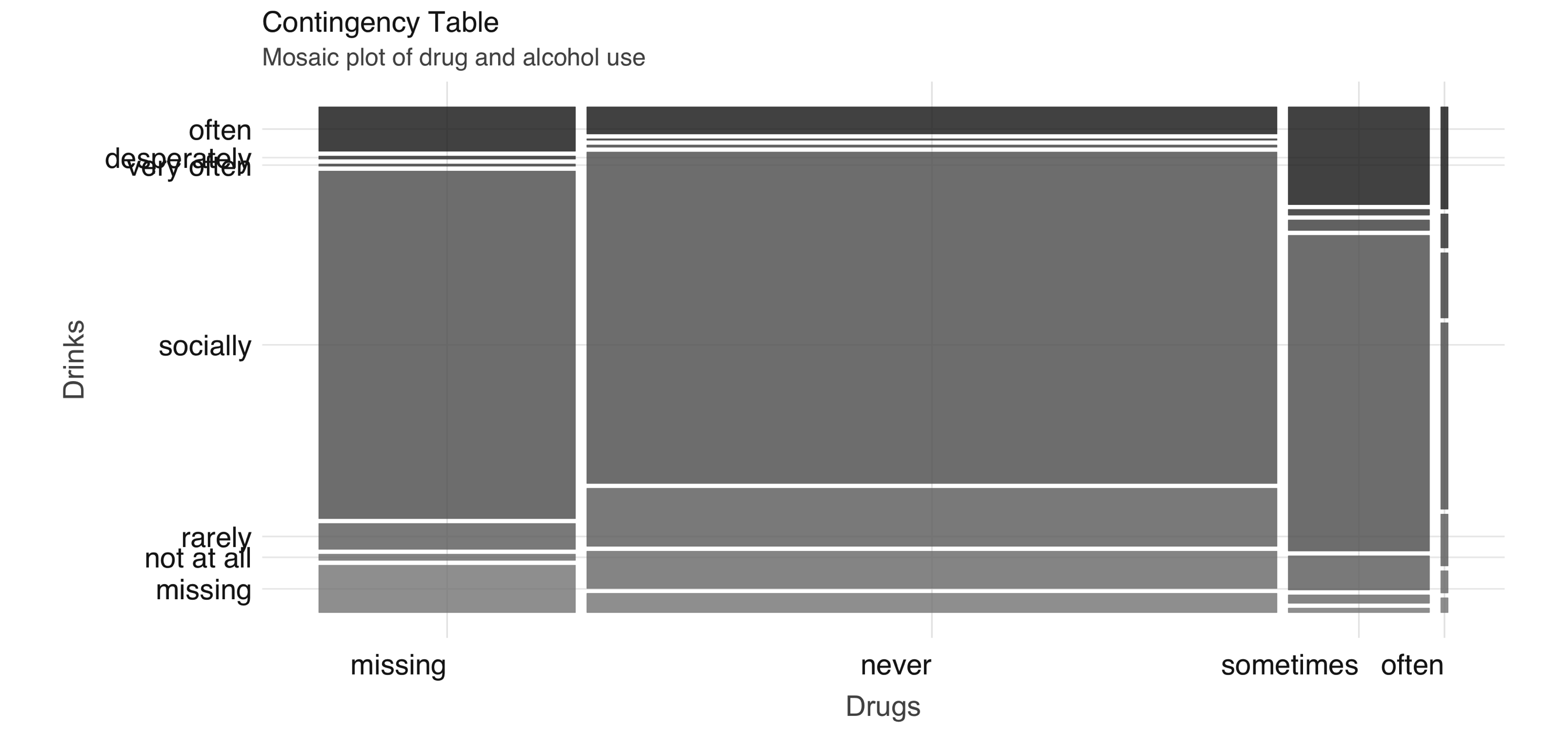
FIGURE 4.3: Mosaic plot of drug and alcohol use
To further explore the relationship between these two variables, we can perform correspondence analysis18 using the FactoMineR package. This technique enables us to summarize the relationship between the high-dimensional factor levels by mapping each level to a point on the plane. We first obtain the mapping using FactoMineR::CA() as follows:
dd_obj <- contingency_tbl %>%
  tibble::column_to_rownames(var = "drinks_drugs") %>%
  FactoMineR::CA(graph = FALSE)
We can then plot the results using ggplot, which you can see in Figure 4.4:
dd_drugs <-
  dd_obj$row$coord %>%
  as.data.frame() %>%
  mutate(
    label = gsub("_", " ", rownames(dd_obj$row$coord)),
    Variable = "Drugs"
  )

dd_drinks <-
  dd_obj$col$coord %>%
  as.data.frame() %>%
  mutate(
    label = gsub("_", " ", rownames(dd_obj$col$coord)),
    Variable = "Alcohol"
  )

ca_coord <- rbind(dd_drugs, dd_drinks)

ggplot(ca_coord, aes(x = `Dim 1`, y = `Dim 2`,
                     col = Variable)) +
  geom_vline(xintercept = 0) +
  geom_hline(yintercept = 0) +
  geom_text(aes(label = label)) +
  coord_equal()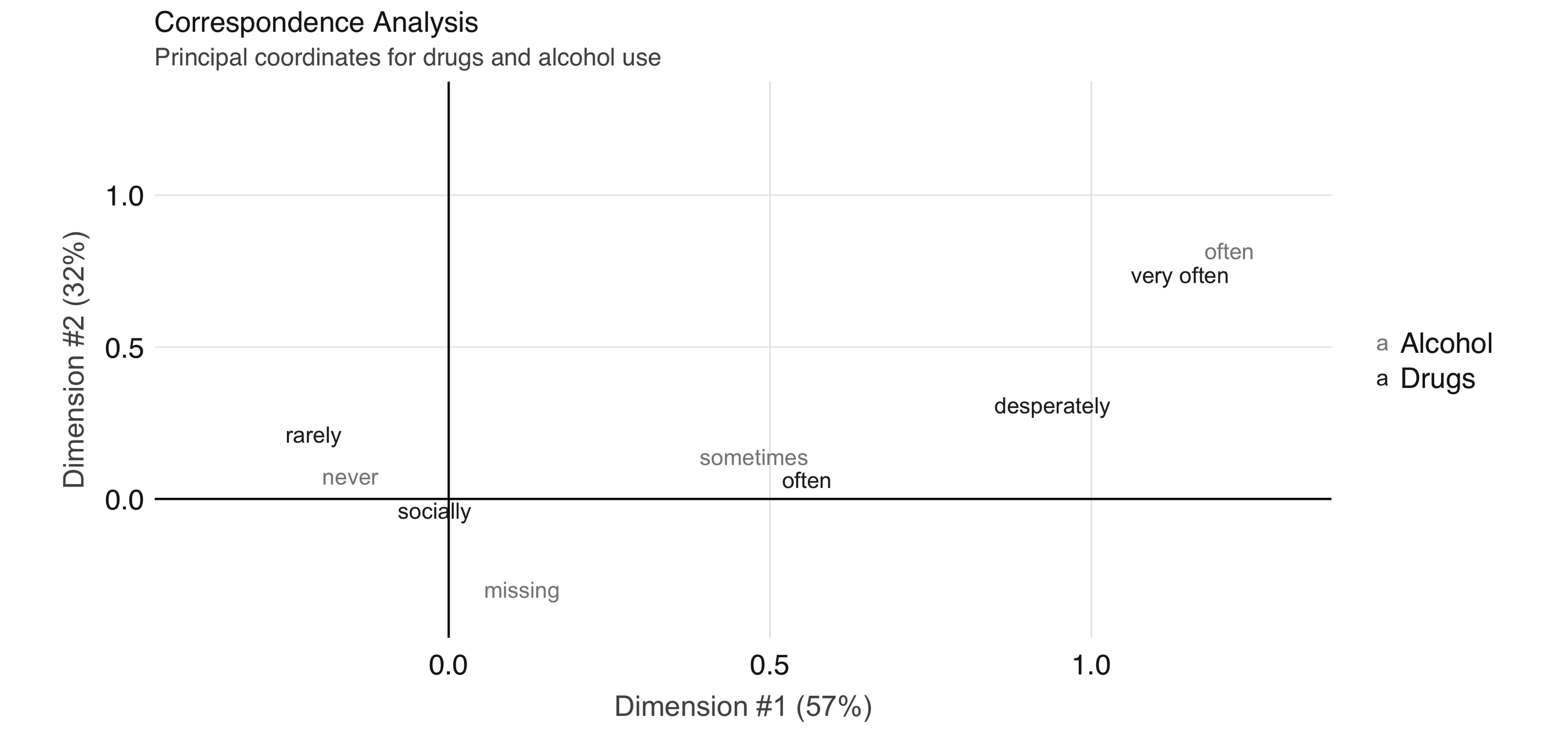
FIGURE 4.4: Correspondence analysis principal coordinates for drug and alcohol use
In Figure 4.4, we see that the correspondence analysis procedure has transformed the factors into variables called principal coordinates, which correspond to the axes in the plot and represent how much information in the contingency table they contain. We can, for example, interpret the proximity of “drinking often” and “using drugs very often” as indicating association.
This concludes our discussion on EDA. Let’s proceed to feature engineering.
4.3 Feature Engineering
The feature engineering exercise comprises transforming the data to increase the performance of the model. This can include things like centering and scaling numerical values and performing string manipulation to extract meaningful variables. It also often includes variable selection—the process of selecting which predictors are used in the model.
In Figure 4.1 we see that the age variable has a range from 18 to over 60. Some algorithms, especially neural networks, train faster if we normalize our inputs so that they are of the same magnitude. Let’s now normalize the age variable by removing the mean and scaling to unit variance, beginning by calculating its mean and standard deviation:
scale_values <- okc_train %>%
  summarize(
    mean_age = mean(age),
    sd_age = sd(age)
  ) %>%
  collect()

scale_values
# A tibble: 1 x 2
mean_age sd_age
<dbl> <dbl>
1 32.3 9.44We can then use these to transform the dataset:
okc_train <- okc_train %>%
  mutate(scaled_age = (age - !!scale_values$mean_age) /
!!scale_values$sd_age)In Figure 4.5, we see that the scaled age variable has values that are closer to zero. We now move on to discussing other types of transformations, but during your feature engineering workflow you might want to perform the normalization for all numeric variables that you want to include in the model.
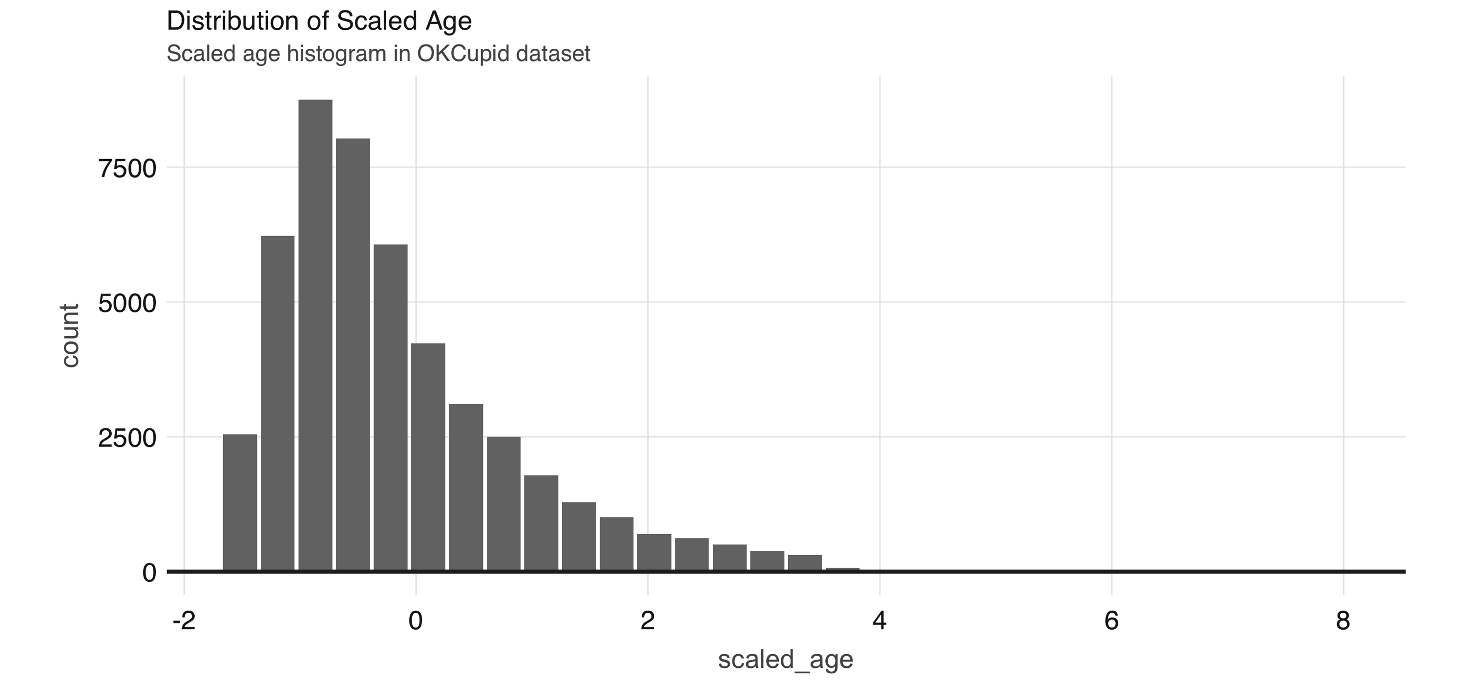
FIGURE 4.5: Distribution of scaled age
Since some of the profile features are multiple-select—in other words, a person can choose to associate multiple options for a variable—we need to process them before we can build meaningful models. If we take a look at the ethnicity column, for example, we see that there are many different combinations:
# Source: spark<?> [?? x 2]
   ethnicity                                     n
   <chr>                                     <dbl>
 1 hispanic / latin, white                    1051
 2 black, pacific islander, hispanic / latin     2
 3 asian, black, pacific islander                5
 4 black, native american, white                91
 5 middle eastern, white, other                 34
 6 asian, other                                 78
 7 asian, black, white                          12
 8 asian, hispanic / latin, white, other         7
 9 middle eastern, pacific islander              1
10 indian, hispanic / latin                      5
# … with more rows
One way to proceed would be to treat each combination of races as a separate level, but that would lead to a very large number of levels, which becomes problematic in many algorithms. To better encode this information, we can create dummy variables for each race, as follows:
ethnicities <- c("asian", "middle eastern", "black", "native american", "indian",
                 "pacific islander", "hispanic / latin", "white", "other")
ethnicity_vars <- ethnicities %>%
  purrr::map(~ expr(ifelse(like(ethnicity, !!.x), 1, 0))) %>%
  purrr::set_names(paste0("ethnicity_", gsub("\\s|/", "", ethnicities)))
okc_train <- mutate(okc_train, !!!ethnicity_vars)
okc_train %>%
  select(starts_with("ethnicity_")) %>%
  glimpse()
Observations: ??
Variables: 9
Database: spark_connection
$ ethnicity_asian <dbl> 0, 0, 0, 0, 0, 0, 0, 0, 0, 0…
$ ethnicity_middleeastern <dbl> 0, 0, 0, 0, 0, 0, 0, 0, 0, 0…
$ ethnicity_black <dbl> 0, 1, 0, 0, 0, 0, 0, 0, 0, 0…
$ ethnicity_nativeamerican <dbl> 0, 0, 0, 0, 0, 0, 0, 0, 0, 0…
$ ethnicity_indian <dbl> 0, 0, 0, 0, 0, 0, 0, 0, 0, 0…
$ ethnicity_pacificislander <dbl> 0, 0, 0, 0, 0, 0, 0, 0, 0, 0…
$ ethnicity_hispaniclatin <dbl> 0, 0, 0, 0, 0, 0, 0, 0, 0, 0…
$ ethnicity_white <dbl> 1, 0, 1, 0, 1, 1, 1, 0, 1, 0…
$ ethnicity_other <dbl> 0, 0, 0, 0, 0, 0, 0, 0, 0, 0…For the free text fields, a straightforward way to extract features is counting the total number of characters. We will store the train dataset in Spark’s memory with compute() to speed up computation.
okc_train <- okc_train %>%
  mutate(
    essay_length = char_length(paste(!!!syms(paste0("essay", 0:9))))
) %>% compute()We can see the distribution of the essay_length variable in Figure 4.6.
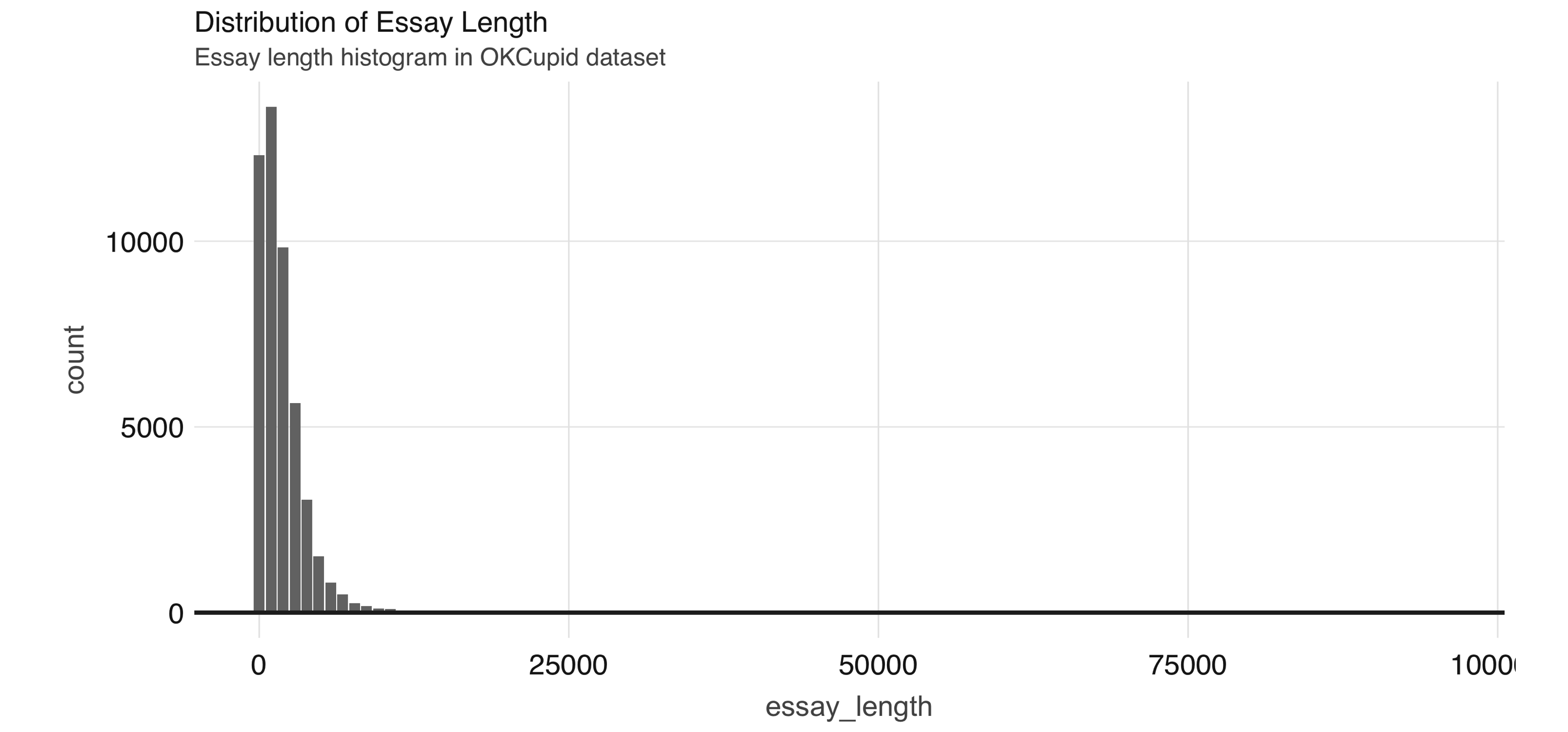
FIGURE 4.6: Distribution of essay length
We use this dataset in Chapter 5, so let’s save it first as a Parquet file—an efficient file format ideal for numeric data:
Now that we have a few more features to work with, we can begin running some unsupervised learning algorithms.
4.4 Supervised Learning
Once we have a good grasp on our dataset, we can start building some models. Before we do so, however, we need to come up with a plan to tune and validate the “candidate” models—in modeling projects, we often try different types of models and ways to fit them to see which ones perform the best. Since we are dealing with a binary classification problem, the metrics we can use include accuracy, precision, sensitivity, and area under the receiver operating characteristic curve (ROC AUC), among others. The metric you optimize depends on your specific business problem, but for this exercise, we will focus on the ROC AUC.
It is important that we don’t peek at the testing holdout set until the very end, because any information we obtain could influence our modeling decisions, which would in turn make our estimates of model performance less credible. For tuning and validation, we perform 10-fold cross-validation, which is a standard approach for model tuning. The scheme works as follows: we first divide our dataset into 10 approximately equal-sized subsets. We take the 2nd to 10th sets together as the training set for an algorithm and validate the resulting model on the 1st set. Next, we reserve the 2nd set as the validation set and train the algorithm on the 1st and 3rd to 10th sets. In total, we train 10 models and average the performance. If time and resources allow, you can also perform this procedure multiple times with different random partitions of the data. In our case, we will demonstrate how to perform the cross-validation once. Hereinafter, we refer to the training set associated with each split as the analysis data, and the validation set as assessment data.
Using the sdf_random_split() function, we can create a list of subsets from our okc_train table:
vfolds <- sdf_random_split(
  okc_train,
  weights = purrr::set_names(rep(0.1, 10), paste0("fold", 1:10)),
  seed = 42
)
We then create our first analysis/assessment split as follows:
One item we need to carefully treat here is the scaling of variables. We need to make sure that we do not leak any information from the assessment set to the analysis set, so we calculate the mean and standard deviation on the analysis set only and apply the same transformation to both sets. Here is how we would handle this for the age variable:
make_scale_age <- function(analysis_data) {
  scale_values <- analysis_data %>%
    summarize(
      mean_age = mean(age),
      sd_age = sd(age)
    ) %>%
    collect()

  function(data) {
    data %>%
      mutate(scaled_age = (age - !!scale_values$mean_age) / !!scale_values$sd_age)
  }
}

scale_age <- make_scale_age(analysis_set)
train_set <- scale_age(analysis_set)
validation_set <- scale_age(assessment_set)
For brevity, here we show only how to transform the age variable. In practice, however, you would want to normalize each one of your continuous predictors, such as the essay_length variable we derived in the previous section.
Logistic regression is often a reasonable starting point for binary classification problems, so let’s give it a try. Suppose also that our domain knowledge provides us with an initial set of predictors. We can then fit a model by using the Formula interface:
lr <- ml_logistic_regression(
  analysis_set, not_working ~ scaled_age + sex + drinks + drugs + essay_length
)
lr
Formula: not_working ~ scaled_age + sex + drinks + drugs + essay_length
Coefficients:
(Intercept) scaled_age sex_m drinks_socially
-2.823517e+00 -1.309498e+00 -1.918137e-01 2.235833e-01
drinks_rarely drinks_often drinks_not at all drinks_missing
6.732361e-01 7.572970e-02 8.214072e-01 -4.456326e-01
drinks_very often drugs_never drugs_missing drugs_sometimes
8.032052e-02 -1.712702e-01 -3.995422e-01 -7.483491e-02
essay_length
3.664964e-05 To obtain a summary of performance metrics on the assessment set, we can use the ml_evaluate() function:
You can print validation_summary to see the available metrics:
BinaryLogisticRegressionSummaryImpl
 Access the following via `$` or `ml_summary()`.
 - features_col()
 - label_col()
 - predictions()
 - probability_col()
 - area_under_roc()
 - f_measure_by_threshold()
 - pr()
 - precision_by_threshold()
 - recall_by_threshold()
 - roc()
 - prediction_col()
 - accuracy()
 - f_measure_by_label()
 - false_positive_rate_by_label()
 - labels()
 - precision_by_label()
 - recall_by_label()
 - true_positive_rate_by_label()
 - weighted_f_measure()
 - weighted_false_positive_rate()
 - weighted_precision()
 - weighted_recall()
 - weighted_true_positive_rate()
We can plot the ROC curve by collecting the output of validation_summary$roc() and using ggplot2:
roc <- validation_summary$roc() %>%
  collect()

ggplot(roc, aes(x = FPR, y = TPR)) +
  geom_line() + geom_abline(lty = "dashed")
Figure 4.7 shows the results of the plot.
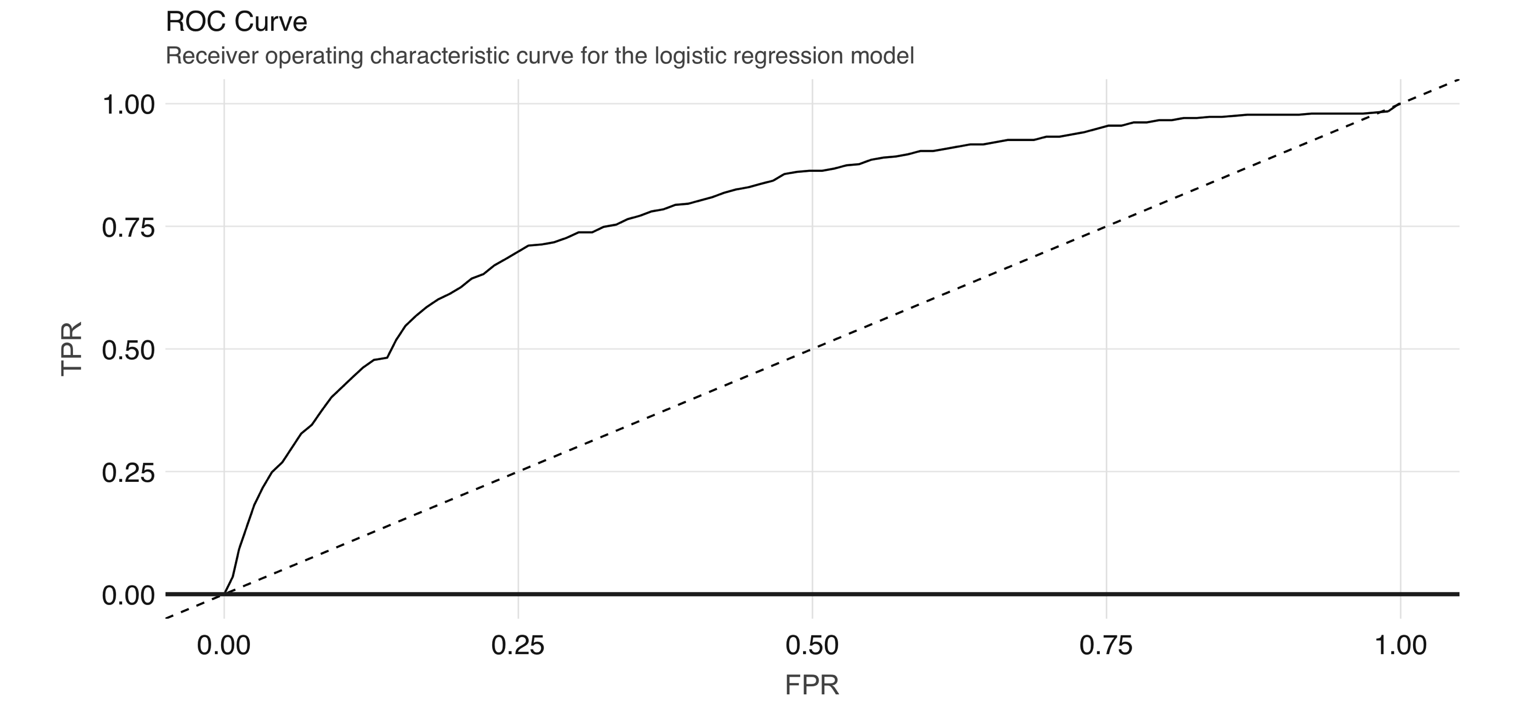
FIGURE 4.7: ROC curve for the logistic regression model
The ROC curve plots the true positive rate (sensitivity) against the false positive rate (1–specificity) for varying values of the classification threshold. In practice, the business problem helps to determine where on the curve one sets the threshold for classification. The AUC is a summary measure for determining the quality of a model, and we can compute it by calling the area_under_roc() function.
[1] 0.7872754Note: Spark provides evaluation methods for only generalized linear models (including linear models and logistic regression). For other algorithms, you can use the evaluator functions (e.g., ml_binary_classification_evaluator() on the prediction DataFrame) or compute your own metrics.
Now, we can easily repeat the logic we already have and apply it to each analysis/assessment split:
cv_results <- purrr::map_df(1:10, function(v) {
  analysis_set <- do.call(rbind, vfolds[setdiff(1:10, v)]) %>% compute()
  assessment_set <- vfolds[[v]]

  scale_age <- make_scale_age(analysis_set)
  train_set <- scale_age(analysis_set)
  validation_set <- scale_age(assessment_set)

  model <- ml_logistic_regression(
    analysis_set, not_working ~ scaled_age + sex + drinks + drugs + essay_length
  )
  s <- ml_evaluate(model, assessment_set)
  roc_df <- s$roc() %>%
    collect()
  auc <- s$area_under_roc()

  tibble(
    Resample = paste0("Fold", stringr::str_pad(v, width = 2, pad = "0")),
    roc_df = list(roc_df),
    auc = auc
  )
})
This gives us 10 ROC curves:
unnest(cv_results, roc_df) %>%
  ggplot(aes(x = FPR, y = TPR, color = Resample)) +
  geom_line() + geom_abline(lty = "dashed")
Figure 4.8 shows the results of the plot.
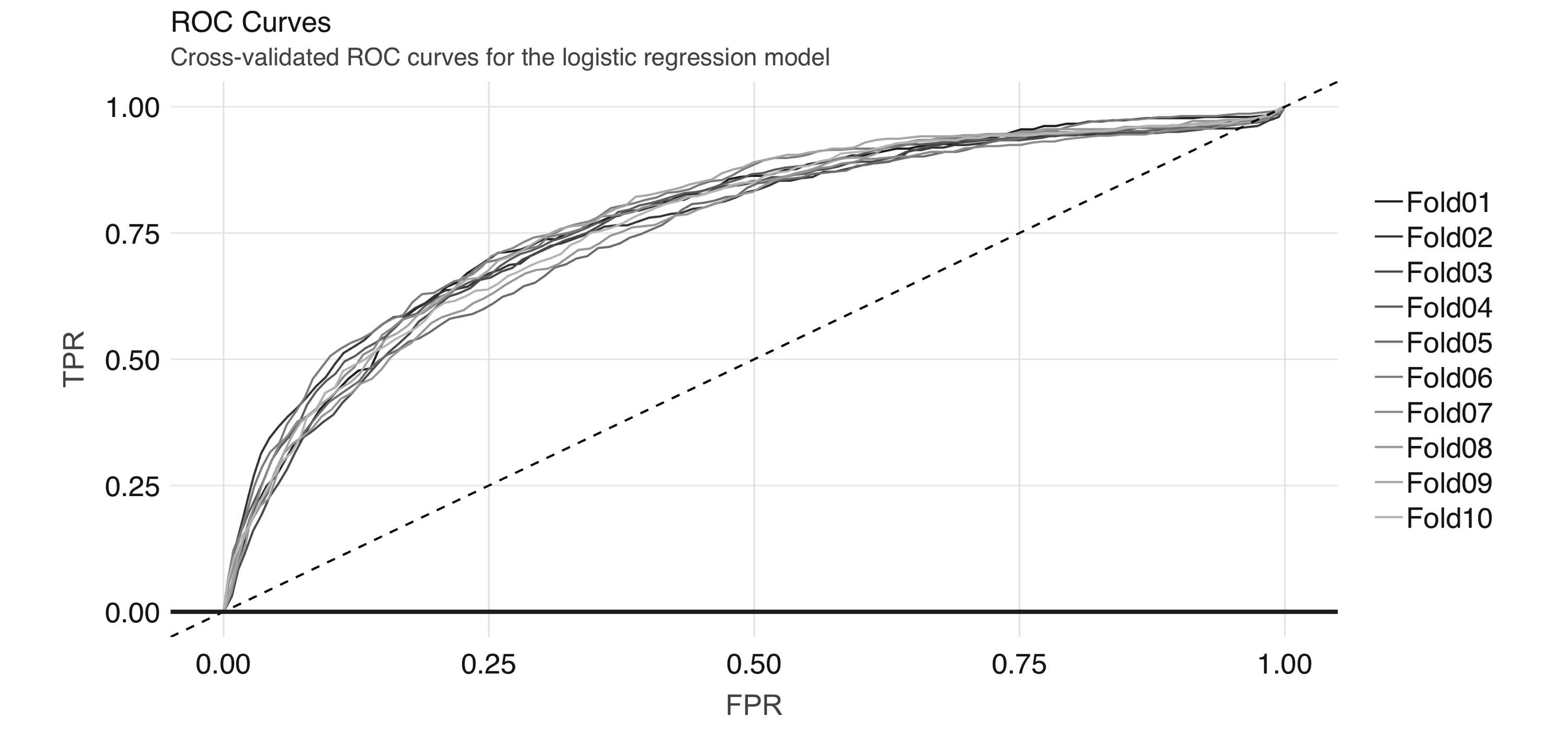
FIGURE 4.8: Cross-validated ROC curves for the logistic regression model
And we can obtain the average AUC metric:
[1] 0.77151024.4.1 Generalized Linear Regression
If you are interested in generalized linear model (GLM) diagnostics,you can also fit a logistic regression via the generalized linear regression interface by specifying family = "binomial". Because the result is a regression model, the ml_predict() method does not give class probabilities. However, it includes confidence intervals for coefficient estimates:
glr <- ml_generalized_linear_regression(
  analysis_set,
  not_working ~ scaled_age + sex + drinks + drugs,
  family = "binomial"
)

tidy_glr <- tidy(glr)
We can extract the coefficient estimates into a tidy DataFrame, which we can then process further—for example, to create a coefficient plot, which you can see in Figure 4.9.
tidy_glr %>%
  ggplot(aes(x = term, y = estimate)) +
  geom_point() +
  geom_errorbar(
    aes(ymin = estimate - 1.96 * std.error,
       ymax = estimate + 1.96 * std.error, width = .1)
  ) +
  coord_flip() +
  geom_hline(yintercept = 0, linetype = "dashed")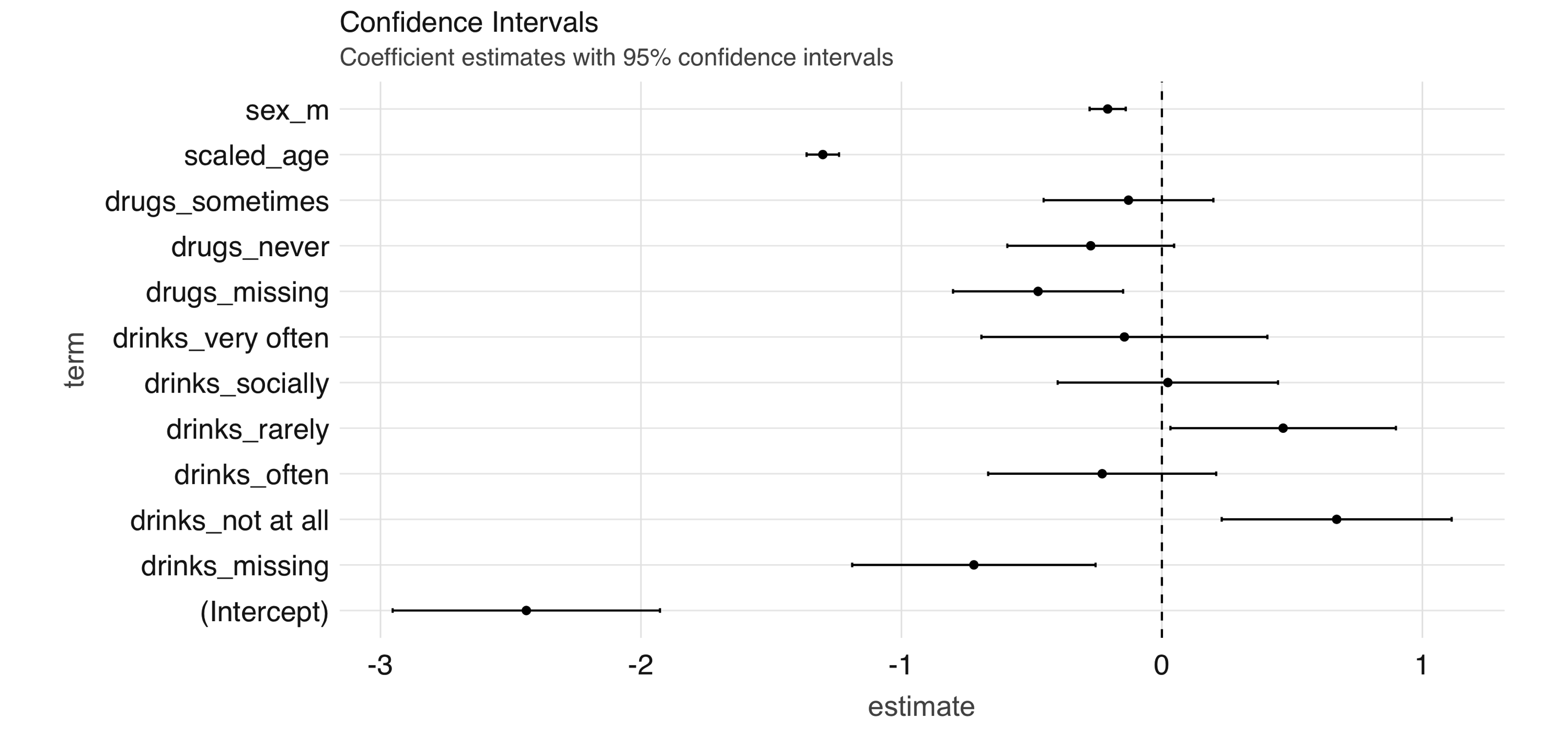
FIGURE 4.9: Coefficient estimates with 95% confidence intervals
Note: Both ml_logistic_regression() and ml_linear_regression() support elastic net regularization19 through the reg_param and elastic_net_param parameters. reg_param corresponds to \(\lambda\), whereas elastic_net_param corresponds to \(\alpha\). ml_generalized_linear_regression() supports only reg_param.
4.4.2 Other Models
Spark supports many of the standard modeling algorithms and it’s easy to apply these models and hyperparameters (values that control the model-fitting process) for your particular problem. You can find a list of supported ML-related functions in the appendix. The interfaces to access these functionalities are largely identical, so it is easy to experiment with them. For example, to fit a neural network model we can run the following:
nn <- ml_multilayer_perceptron_classifier(
  analysis_set,
  not_working ~ scaled_age + sex + drinks + drugs + essay_length,
  layers = c(12, 64, 64, 2)
)
This gives us a feedforward neural network model with two hidden layers of 64 nodes each. Note that you have to specify the correct values for the input and output layers in the layers argument. We can obtain predictions on a validation set using ml_predict():
Then, we can compute the AUC via ml_binary_classification_evaluator():
[1] 0.7812709Up until now, we have not looked into the unstructured text in the essay fields apart from doing simple character counts. In the next section, we explore the textual data in more depth.
4.5 Unsupervised Learning
Along with speech, images, and videos, textual data is one of the components of the big data explosion. Prior to modern text-mining techniques and the computational resources to support them, companies had little use for freeform text fields. Today, text is considered a rich source of insights that can be found anywhere from physician’s notes to customer complaints. In this section, we show some basic text analysis capabilities of sparklyr. If you would like more background on text-mining techniques, we recommend reading Text Mining with R by David Robinson and Julie Silge (O’Reilly).
In this section, we show how to perform a basic topic-modeling task on the essay data in the OKCupid dataset. Our plan is to concatenate the essay fields (of which there are 10) of each profile and regard each profile as a document, then attempt to discover topics (we define these soon) using Latent Dirichlet Allocation (LDA).
4.5.1 Data Preparation
As always, before analyzing a dataset (or a subset of one), we want to take a quick look at it to orient ourselves. In this case, we are interested in the freeform text that the users entered into their dating profiles.
Observations: ??
Variables: 10
Database: spark_connection
$ essay0 <chr> "about me:<br />\n<br />\ni would love to think that…
$ essay1 <chr> "currently working as an international agent for a f…
$ essay2 <chr> "making people laugh.<br />\nranting about a good sa…
$ essay3 <chr> "the way i look. i am a six foot half asian, half ca…
$ essay4 <chr> "books:<br />\nabsurdistan, the republic, of mice an…
$ essay5 <chr> "food.<br />\nwater.<br />\ncell phone.<br />\nshelt…
$ essay6 <chr> "duality and humorous things", "missing", "missing",…
$ essay7 <chr> "trying to find someone to hang out with. i am down …
$ essay8 <chr> "i am new to california and looking for someone to w…
$ essay9 <chr> "you want to be swept off your feet!<br />\nyou are …
Just from this output, we see the following:
- The text contains HTML tags
- The text contains the newline (
\n) character - There are missing values in the data
The HTML tags and special characters pollute the data since they are not directly input by the user and do not provide interesting information. Similarly, since we have encoded missing character fields with the missing string, we need to remove it. (Note that by doing this we are also removing instances of the word “missing” written by the users, but the information lost from this removal is likely to be small.)
As you analyze your own text data, you will quickly come across and become familiar with the peculiarities of the specific dataset. As with tabular numerical data, preprocessing text data is an iterative process, and after a few tries we have the following transformations:
essays <- essays %>%
# Replace `missing` with empty string.
mutate_all(list(~ ifelse(. == "missing", "", .))) %>%
# Concatenate the columns.
mutate(essay = paste(!!!syms(essay_cols))) %>%
# Remove miscellaneous characters and HTML tags
mutate(words = regexp_replace(essay, "\\n| |<[^>]*>|[^A-Za-z|']", " "))Note here we are using regex_replace(), which is a Spark SQL function. Next, we discuss LDA and how to apply it to our cleaned dataset.
4.5.2 Topic Modeling
LDA is a type of topic model for identifying abstract “topics” in a set of documents. It is an unsupervised algorithm in that we do not provide any labels, or topics, for the input documents. LDA posits that each document is a mixture of topics, and each topic is a mixture of words. During training, it attempts to estimate both of these simultaneously. A typical use case for topic models involves categorizing many documents, for which the large number of documents renders manual approaches infeasible. The application domains range from GitHub issues to legal documents.
After we have a reasonably clean dataset following the workflow in the previous section, we can fit an LDA model with ml_lda():
stop_words <- ml_default_stop_words(sc) %>%
  c(
    "like", "love", "good", "music", "friends", "people", "life",
    "time", "things", "food", "really", "also", "movies"
  )

lda_model <-  ml_lda(essays, ~ words, k = 6, max_iter = 1, min_token_length = 4,
                     stop_words = stop_words, min_df = 5)
We are also including a stop_words vector, consisting of commonly used English words and common words in our dataset, that instructs the algorithm to ignore them. After the model is fit, we can use the tidy() function to extract the associated betas, which are the per-topic-per-word probabilities, from the model.
# A tibble: 256,992 x 3
   topic term      beta
   <int> <chr>    <dbl>
 1     0 know      303.
 2     0 work      250.
 3     0 want      367.
 4     0 books     211.
 5     0 family    213.
 6     0 think     291.
 7     0 going     160.
 8     0 anything  292.
 9     0 enjoy     145.
10     0 much      272.
# … with 256,982 more rows
We can then visualize this output by looking at word probabilities by topic. In Figure 4.10 and Figure 4.11, we show the results at 1 iteration and 100 iterations. The code that generates Figure 4.10 follows; to generate Figure 4.11, you would need to set max_iter = 100 when running ml_lda(), but beware that this can take a really long time in a single machine—this is the kind of big-compute problem that a proper Spark cluster would be able to easily tackle.
betas %>%
  group_by(topic) %>%
  top_n(10, beta) %>%
  ungroup() %>%
  arrange(topic, -beta) %>%
  mutate(term = reorder(term, beta)) %>%
  ggplot(aes(term, beta, fill = factor(topic))) +
    geom_col(show.legend = FALSE) +
    facet_wrap(~ topic, scales = "free") +
    coord_flip()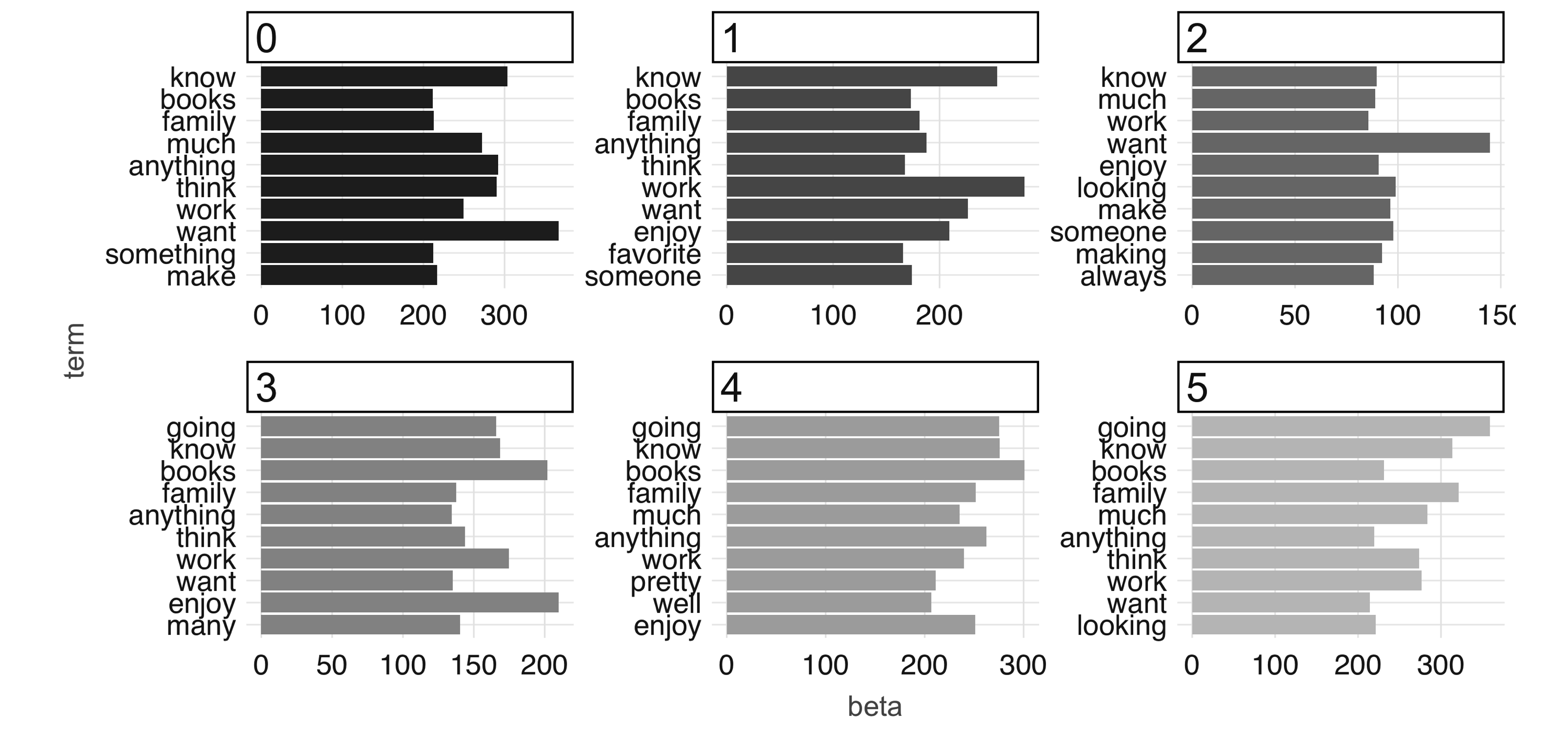
FIGURE 4.10: The most common terms per topic in the first iteration
At 100 iterations, we can see “topics” starting to emerge. This could be interesting information in its own right if you were digging into a large collection of documents with which you aren’t familiar. The learned topics can also serve as features in a downstream supervised learning task; for example, we could consider using the topic number as a predictor in our model to predict employment status in our predictive modeling example.
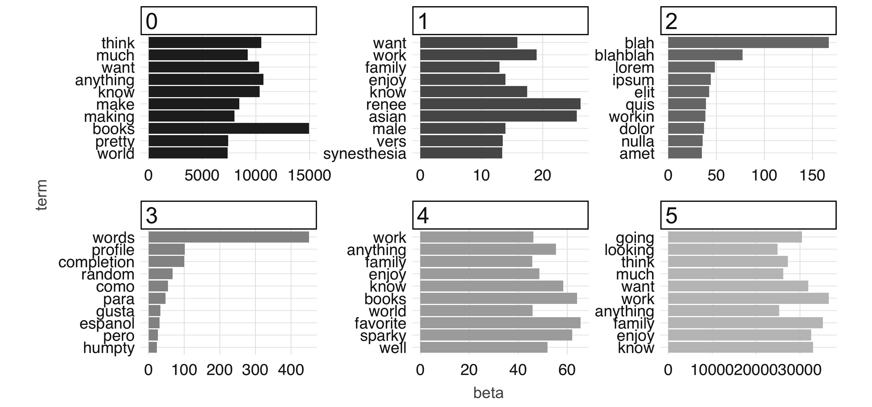
FIGURE 4.11: The most common terms per topic after 100 iterations
Finally, to conclude this chapter you should disconnect from Spark. Chapter 5 also makes use of the OKCupid dataset, but we provide instructions to reload it from scratch:
4.6 Recap
In this chapter, we covered the basics of building predictive models in Spark with R by presenting the topics of EDA, feature engineering, and building supervised models, in which we explored using logistic regression and neural networks—just to pick a few from dozens of models available in Spark through MLlib.
We then explored how to use unsupervised learning to process raw text, in which you created a topic model that automatically grouped the profiles into six categories. We demonstrated that building the topic model can take a significant amount of time using a single machine, which is a nearly perfect segue to introduce full-sized computing clusters! But hold that thought: we first need to consider how to automate data science workflows.
As we mentioned when introducing this chapter, emphasis was placed on predictive modeling. Spark can help with data science at scale, but it can also assist in productionizing data science workflows into automated processes, known by many as machine learning. Chapter 5 presents the tools we will need to take our predictive models, and even our entire training workflows, into automated environments that can run continuously or be exported and consumed in web applications, mobile applications, and more.
Kuhn M, Johnson K (2019). Feature Engineering and Selection: A Practical Approach for Predictive Models. (CRC PRess.)↩
We acknowledge that the terms here might mean different things to different people and that there is a continuum between the two approaches; however, they are defined.↩
Kim AY, Escobedo-Land A (2015). “OKCupid data for introductory statistics and data science courses.” Journal of Statistics Education, 23(2).↩
Greenacre M (2017). Correspondence analysis in practice. Chapman and Hall/CRC.↩
Zou H, Hastie T (2005). “Regularization and variable selection via the elastic net.” Journal of the royal statistical society: series B (statistical methodology), 67(2), 301–320.↩